My Janery Sewing Studio is finally . . . wait for it. . . finished! Just in time for me to enter it in the Creating with the Stars contest at East Coast Creative. So exciting!!
And you know what? I feel like this is my best propaganda yet to convince you that, when you rent, you can still customize a space to make it suit your needs and look awesome. And it feels so good to look at the room and know that I transformed it from a totally blank slate.
Because this is the space where I let loose my creativity, I wanted to keep the decor relatively simple. Enter the pure white and gold theme, and lots of white space on the walls.
Before I talk details, first let me give you a quick visual tour of the 10 x 10 room. We’ll start at the French doors and circle the room.
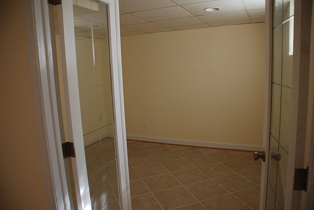
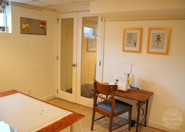
Looking through the open doors, it’s hard to believe the room was ever boring and empty like this:
 Now it is so awesome I can barely contain myself!!
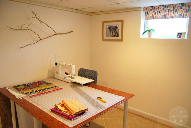
This wall may someday hold a floor-to-ceiling cork board.
Now, just in case you’re new here, I’d like to show you all the projects I did to transform the space.
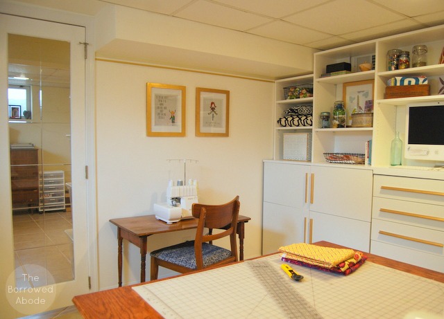
1. For my serger corner, I found an antique sewing table and chair in my parents’ basement, and recovered the chair. I painted the artwork frames with gold leaf paint.
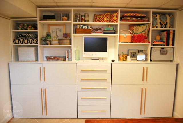
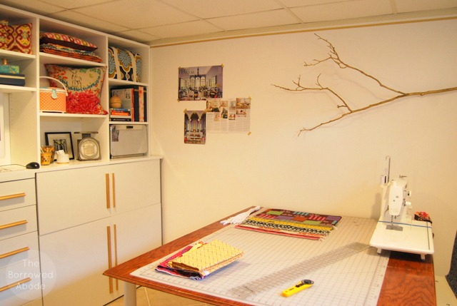
2. The rental-friendly “faux built-in” shelves were my biggest creation for the space. They were worth every second of trial and error that led to them, and I’m proud that I did it by myself.
The bottom half is Ikea Besta cabinets that I already had, and the top half is a freestanding 10-foot-wide adjustable shelf unit that I built and then slid into place. I trimmed up the unit and DIY’ed some decorative gold hardware for the bottom cabinet doors, just to make it a little less Ikea and a little more custom looking.
The shelves and cabinets contain tons of storage, even if the top shelves look styled. They have a mix of finished products, quilt pieces, notions, fabric samples, shipping supplies, and books that I use. When I’m churning out loads of products I’ll probably use some of the shelves to store stacks of items in-progress.
3. I built my 7’x4′ sewing table and then recently converted it to a drop-leaf table for more flexibility in this small room. Here is is shown with only one leaf in use.
4. My Ikea office chair is made prettier by a quick slipcover I sewed for it. (Tutorial later this week!)
5. This wall might make you wonder. 🙂 First, I’ve taped up a few favorite magazine pages – some of a space that is gorgeous, as well as an interview with Aerin Lauder, who inspires me in my business. I’ll probably add to this collage over time.
I love branches, and anything from nature really, so I was inspired to paint a branch gold and hang it on the wall with fishing twine. It looks so much better in person than in this photo. The branch is easily removed when I use the white wall for shooting product photography.
6. When everything else was done, I hung my favorite photo of Charlie to look over me as I work. The origin of Janery and my upcoming dog bed line (Charlie Cushions), was all inspired by Charlie many years ago. Until we lost her, she sat right outside the studio whenever I worked.
7. After painting the room pure white to simplify the color palette, I used two gold washi tapes to create a removable border along the ceiling. I thought it would look silly, but it actually makes the room look more finished.
8. I upgraded a cheap plastic roller blind with some decorative wrapping paper. It provides a pop of color and privacy when this space serves as a guest room.
9. I created a pretty gold pinboard using thin plywood, a roll of cork, and a gold radiator grate from the hardware store. (Tutorial coming soon.)
And that’s it! I hope you enjoyed the virtual tour of my sewing studio, and if you rent, I hope it inspired you to try and customize the spaces you have to work with too! If you have any questions please let me know.
Shared in the IHeart Organizing March Organizing Party!


6 Comments
Jane – what are the pictures you have above the serger table? I was hoping for a closer look just cause I’m nosy. 😉
Hey! I should share a closeup of them and other things. Thanks! They’re from The Little Illustrator on Etsy. https://www.etsy.com/shop/thelittleillustrator/
This looks amazing! Your built ins have been inspiring me since you first started and they turned out amazing – they’re beautiful and they look completely functional.
Looks great! I would love it if you joined and contribute your awesome posts at my link party at City of Creative Dreams on Fridays 😀 Hope to see you there at City of Creative Dreams Link Party
[…] I completed my Janery Studio Makeover, I did a lot of simple projects to make the space look and feel a little more finished. One was […]
[…] been trying to improve my product photos for years, starting with painting the walls of my studio bright white, then buying (affiliate link) this inexpensive studio lighting kit, and then buying a […]