When I last showed you my sewing corner of my studio, I had shelves hung but nothing on them. 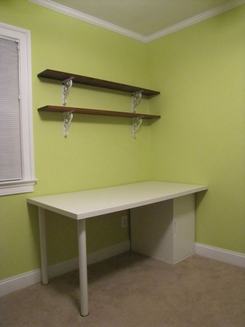
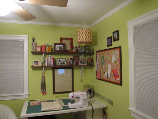
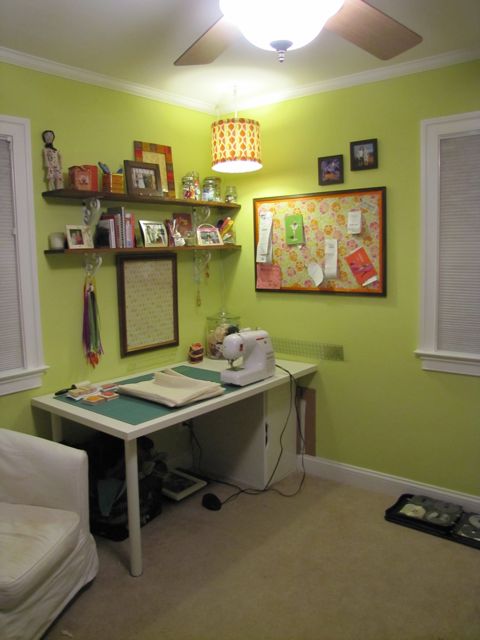
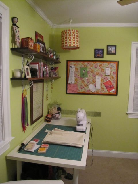
Well, now I have photos to show you of the filled shelves, with the vintage jars full of thread, etc. But right now I want to ask you about the lamp hanging over the desk:
I did the usual – found a plain lampshade and a hanging cord set (both from Ikea) and then used ModPodge to cover the shade with some fabric and a ribbon liner. Then I hung it over the sewing desk, because that area was seriously lacking focused light. My eyes were getting tired from squinting. I felt like an old lady.
So I let there be light, and there was light. And the light was glorious. But the placement of the lamp . . . well, I’m not so sure about that. I think it needs to come away from the corner some.
Does it look too squished in to you?
 P.S: Thanks so much to all of you who weighed in with comments (and emails) of advice and encouragement for my friend who’s struggling with some big decisions right now. I can’t wait to share all your kindness with her!
P.S.S: New to the blog? You can check out the beginning of my studio makeover, find details on the patterned dry erase board and cork board, and see how I used vintage jars to store my thread.
And if you want some free help with a rental decorating (or other small space) challenge, drop me a line!



21 Comments
That looks like a great creative space now. Good job!
New blog hop follower
Sweet T Makes Three
Jane, I think it looks fantastic! I need these for my living room…But truthfully I really like it in the corner. From the front it seems to close to the shelves perhaps, but I like how it makes the corner fade and all you see is the workspace.
I can tell from what you did it’s so precise. I might need a tutorial of this… or have you already done one and I blanked on it?
I love this! Funny, I am in the process of redoing my craft room and I hung a lamp like you did. Also, your paint color looks somewhat similar to mine. 🙂
I am so going to check out your info on how you did some of the details in your room! Have a great Thursday!!
I actually kind of like it in the corner. You could move it over the center of the desk and see if you like that better, but the corner just seems cute somehow. It might be different in real life though, I know sometimes it’s hard to tell from photos how close things are.
Wow, the room looks amazing! And the lamp is great … I really need to try *making* my own lamp. Soon :).
I think it looks a little squished. I would center it over the work area … there’s already a lot going on in that corner.
awww! What a happy little sewing corner! =) I would gaze at the photos all day long =)
I think the lamp looks great. Probably if you moved it farther out, it would look truly odd.
I LOVE the hanging lamp. It’s such a space saver too, which would be #1 in my book!
I think the lamp is well positioned and functional. Aesthetically, it’s to the side enough to not hide any of the decorative or practical items. Oh, and it’s damned cute.
I LOVE this space… it makes me want a sewing corner!! I’d probably want the light centered over the workspace or even a little left of the sewing machine, so it could better illuminate the projects without casting a shadow (if it even does cast a shadow in its current spot). It also looks good and doesn’t hide any of the things on your shelf where it is right now, though… tough call!
I think I would center the light over the table? It looks cute and more importantly it should be where it will be the best for you doing projects!
Looks great! I would love to have room for a studio space like this in my own apartment. The breakfast table will have to do for now. I agree with some of the other commenters on moving the lamp over some so it’s more centered over the table. Or maybe you can supplement with a second light – maybe a reading lamp on one of the bookshelves, so you have light on each side.
What a great little happy working space, Jane! Colourful and fun!!
CC
Hi! I am so happy I came across your blog. My fiancé and I just started a blog this past fall when we got engaged. It’s main focus is on our upcoming nuptials (our big fat farm wedding) but I also like to do fun projects (currently many of them are wedding related) but often feel limited due to us being renters. I will definitely be stopping by your blog again for some inspiration. Feel free to stop over and check ours out as well. I am trying to trick it out a bit….so just know that it is a work in progress. I’d love to hear any feedback if you have time. Thanks!
I failed to record our web address correctly in my previou post. It’s actually http://www.ourbigfatfarmwedding.blogspot.com. I forgot the blogspot part of it. However, when I go in to write a new comment with the correct web address in the website slot it says that I am not an administrator of that blog….even though I am currently signed into it right now. Anyway, I have never gotten that error before. Has anyone else had that issue when trying to leave a comment on your blog? Sorry if I am confusing you. Once again, I love your blog! Can’t wait to read more of it.
I don’t think it looks smooshed, but I think it might provide your sewing space with even more light if it was centered over the desk. I LOVE the fabric choces by the way. Gorgeous! And of course…ikea!! Beautiful space, really.
I think the lamp isn’t quite in the optimal space for lighting. I might require more light than you for work though, so if you can see, just enjoy it. You will need to move the items on the shelf to accomodate the new location of the light if you go that route. It seems to be very fluid storage so no problems there. I love the fun colors you are into and that you take the time to make a creative space pretty.
Nobody puts baby in the corner… scootch it over a bit so the light hits over where you’re sitting and you should be all good 🙂
[…] Flip Camera (gotta make that video) and the citrus green wall hooks which just happened to match my new studio walls perfectly, and then I boxed up the rest of the goodies so I could pass them all on to you as a […]
[…] fabric storage installed, jewelry and clothes storage assembled, and a sewing corner created, there were only a few more corners left to tackle: the computer / desk area and the […]
[…] space used to be my sewing room as well, but after starting Janery I had to move the sewing studio and storage to the basement […]