In my new sewing studio the walls are painted and it’s time to get it furnished.
I wanted to attempt a faux built-in cabinetry look for the entire wall. I love Kim’s studio shelving and decided to attempt something similar. Short version: She built an awesome shelving unit, then installed an MDF back on it, then hung it by the MDF back on the wall, so that she didn’t have to hang a million shelves. So genius.
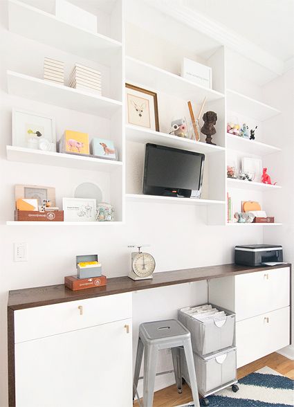
Via Yellow Brick Home
I wanted to use as much of my existing furniture as possible to minimize waste as well as cost. I got super lucky, discovering that the back wall of the studio would fit a row of IKEA Besta shelving units perfectly. I already had two of the wide units, and the space remaining was just the right size for a narrow unit. Once I picked up the skinny Besta at Ikea, I’d have a perfect wall of waist-height storage.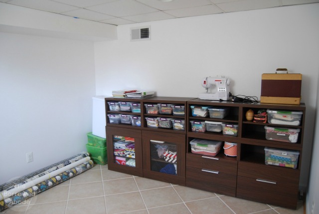
First, I built one massive shelf to cover the tops of the lower Besta cabinets. I had to join together several boards to create this shelf, because it is 16″ deep and 112″ long.
In case you’re wondering, there is no such thing as an affordable 16″ wide piece of lumber. My solution was to join a 10″ board to an 8″ board. How does 10 + 8 = 16 ? Easy: the boards are never as wide as they say. An 8″ piece is actually only 7.25″ wide. It’s frustrating when you need exact measurements, but in this case I was able to fudge it.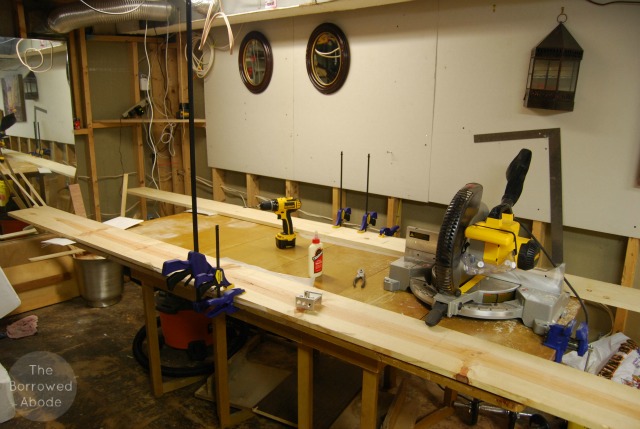
In the photo above, I had two sets of boards that I joined lengthwise to get the 112″ length. These two super-long boards were then joined width-wise to create the deep shelf.
I didn’t want it to look like I just smacked a big white board on top of my dark brown cabinets, so I trimmed the front of the board with thin wood to create a lip that would hang down over the front of the cabinets. I thought that would help give them a more seamless, built-in look. I chose not to use fancy molding because a) it costs more and b) I am going for a more sleek, modern look.
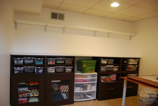
Pictured: The wall shelf looks awful, but the shelf-with-lip that I built to put over the Ikea cabinets looks pretty sweet and custom.
When I wrangled the shelf into the studio and set it on the cabinets, I was thrilled with how well it fit and how it really did create that more built-in look. Things were on a roll, until . . .
I decided to take an easier approach than building and hanging an entire custom shelving unit above the cabinets. I thought I could imitate the look of Kim’s studio shelving by adding white shelves (i.e. painted long boards) to the top half of the storage wall, hanging them on white shelf brackets.
After that first shelf was hung (see above), it looked like crap. Very utilitarian, very unattractive.
At this point you could interrupt me and say “But Jane, why does it have to be attractive? This isn’t room you’re showing off to guests or something.” And while I get that, think of it this way: I spend a lot of time in this room, so I want to be surrounded by beauty. I am more inspired when I enjoy the space I’m working in.
And I believe a well-thought-out room can blend beauty and function and not break the bank. So with that in mind, it was back to the drawing board, where I would try to come up with a better solution, or maybe just bite the bullet and build something as awesome as Kim’s studio shelving.
To be continued . . .
In case you’re new here:


8 Comments
It seems to me that the reason why it looks utilitarian is because of the shelf brackets. If you could hide them it would look fine.
Some unsolicited opinion :
Do you need the full length? for the shelf? The reason why I’m asking, is that you could tidy that up pretty quickly using a couple of the floating shelf thingys you can get from Ikea. Or indeed do a similiar thing with the shelf you’ve already got.
Probably the main thing though, is how much load is the shelf going to take? I’m assuming that something that high isn’t going to be taking much because of the falling on the head giving you concussion risk. So yeah, floating shelves would work. 🙂
You’re absolutely right – the biggest ugliness is the brackets themselves. I need to cover this entire wall in shelves – so floating shelves wouldn’t be strong enough. I have a LOT of stuff to store. I have a few ideas for non-attached-to-wall shelving options, I will flesh them out and research them next week. Thank you for sharing – I always welcome opinions, unsolicited or not!!
I agree that if the brackets were somehow covered/hidden, the wall shelf would look a lot nicer. What about doing something like this:
http://www.desertdomicile.com/2012/09/diy-15-chunky-wooden-floating-shelves.html
It would allow you to have the floating shelf look, but would provide more stability than a regular floating shelf.
[…] Friday we left off with my sad little shelving fail in the studio. As a reader pointed out, it is those awful shelf brackets that make it look so […]
[…] Studio Makeover, Part 3 […]
[…] Studio Makeover, Part 3: A Shelving Fail […]
[…] Studio Makeover, Part 3: A Shelving Fail […]
[…] built-in” shelves were my biggest creation for the space. They were worth every second of trial and error that led to them, and I’m proud that I did it by […]