In the spirit of my January goals to Clear the Clutter and Finish Abandoned Tasks, last night I set about working on my blog. If you’re reading via RSS reader, I would be thrilled if you’d click over to see the changes in real time.
For months, now, the design of this site was driving me crazy. I wanted to simplify the layout and sidebar design, but never got around to it because I was planning on hiring a web design and branding company to completely overhaul my Janery logo, my Borrowed Abode logo, and the website all at once.
But my financial priorities have changed a little bit because of goals with my Janery products (more about that another time), so the full branding overhaul is on hold until spring. That’s why last night I decided to spend just a little time fixing the things that were within my control.
I’m not finished, as I still need Ryan’s help with coding to customize the site, but I’d really like your help, too. I want your opinions, your favorite features, your pet peeves when it comes to blogs in general – because you’re the ones using this site.
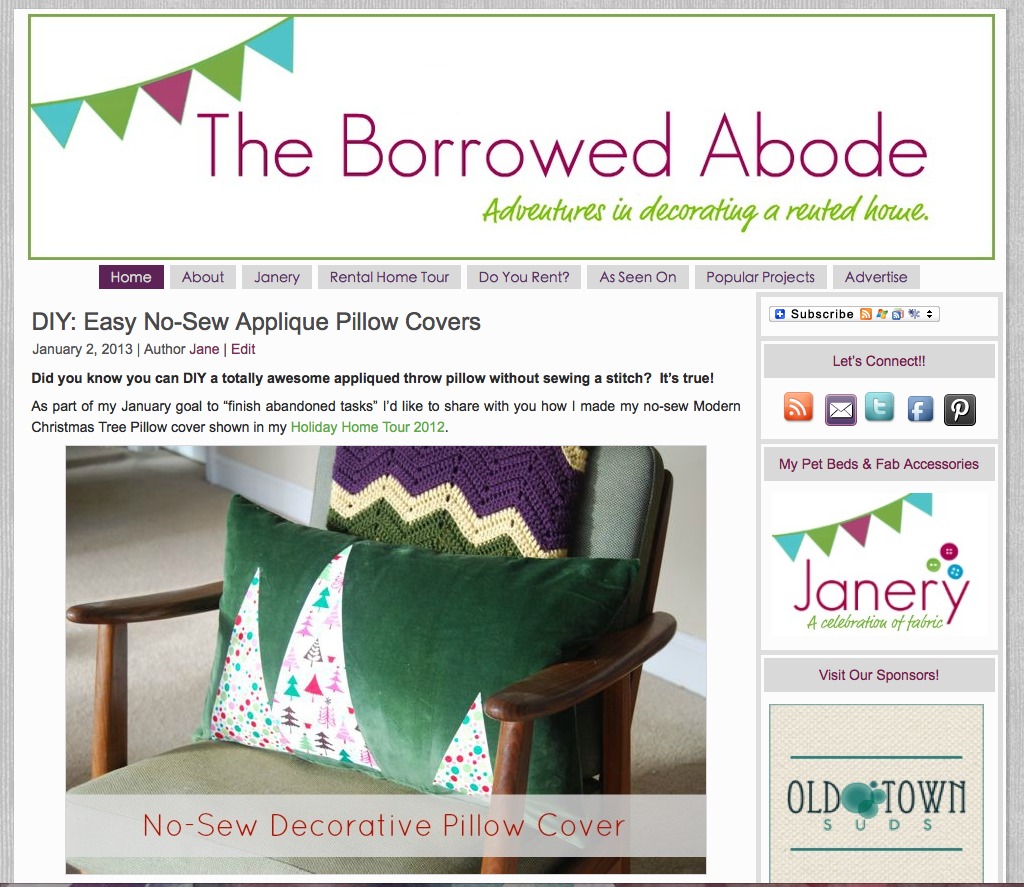
Here is the old site design:

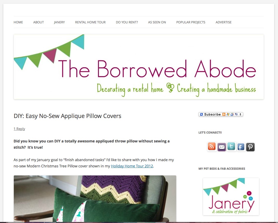
And here is the new version:
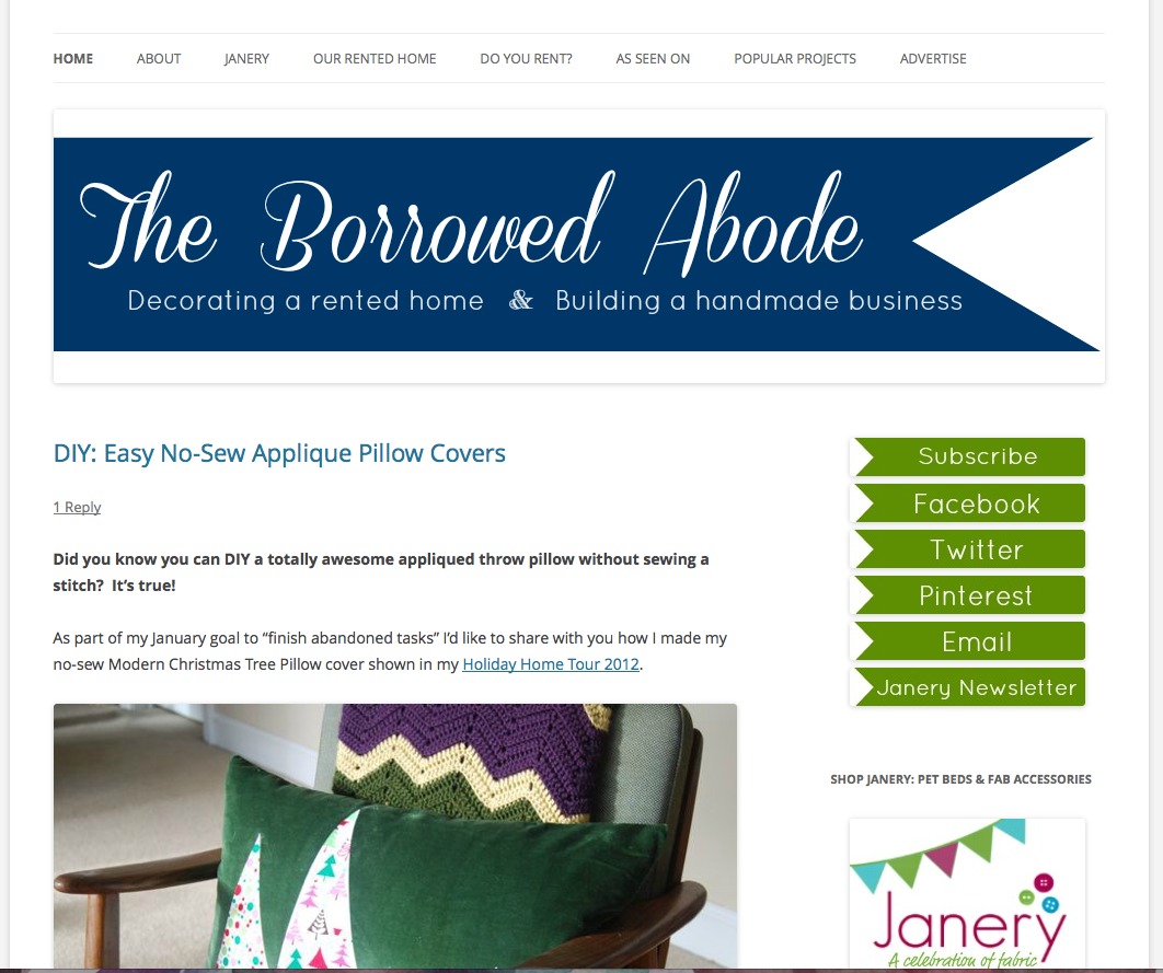
And then I briefly tried uploading a new banner that I designed, but I felt like it lacked color and personality.
 I was reluctant to install a new template and start practically from scratch, because I don’t know how to design behind the scenes instead of in real-time. But finally I decided that it wouldn’t be the end of the world if you guys happened to visit The Borrowed Abode mid-tweak.
Here are my thoughts, as it stands now:
- I’d like to move the top navigation bar to sit below the header, rather than above it
- I’d like to tweak the existing logo so that it is better resolution
- I like the clean white display, but is there too much white? Do I want a background image?
- I’d like to add an “About Me” intro in the top of the sidebar.
- I’d like to add tabbed navigation to the sidebar (for categories, archives, etc)
So here you have it. The Borrowed Abode, in the midst of it’s very own DIY project.
What are your thoughts on the new layout? On the new header logo that I tried? Any feedback is welcome, and thank you in advance for taking the time to share your thoughts!
***Update – thanks to those who pointed out how awkward the commenting button is. It’s at the top, if you haven’t found it yet. I hope I can move that to the bottom of the post in the future. ***


21 Comments
I really like the second design. It’s sleek and clean and blends seamlessly with your Janery logo. =)
Elaine, thanks so much for sharing your feedback!! Just to clarify, do you mean the blue banner one? I really appreciate it.
I like what you’re thinking. I’m all for the white space.
Being a short phrase nerd, I have some ideas for your tagline. Will email once I’ve sorted them out in my head. GOOOOO JANE! You’re rocking.
Katie! Thanks so much – can’t wait to hear what your ideas are. I know it could definitely be shorter. 🙂 You rock!
Personally, I like the white background. I’ve been toying with ditching the cutesy background over at my place in favor of white. I also like the new header, but I agree with you about moving the tabs below it rather than keeping it where it is. I also like how you added the creating a small business tagline. I think that better suits where you’re at right now and gives readers an idea of where you’re going and what they can expect.
Also, this is the first time I’ve commented on your blog since you dropped Disqus (which by the way, I don’t blame you!) and I wanted to mention that I had to search for where to click to comment. It may just be me, but I didn’t want to not say anything and then have you lose comments because others had the same issue.
I’m loving the tweaks so far! I need to set some blog goals for this year. Reworking my design is definitely on the list.
Hi Christina 🙂 I have to say that I am drawn more towards blogs with simple backgrounds and designs these days – that’s why I wanted to migrate towards that look myself. It feels more polished, and I guess professional, to me. But that’s only my opinion.
Thanks also for noticing the inclusion of small business in the tagline. It’s such a significant part of my life that I thought it deserved inclusion. Regarding the search for the “comment” button – yikes! Thanks for letting me know. And yeah, I dropped Disqus. I’ll discuss that in a blog post someday. So glad it’s gone.
Thanks for sharing your thoughts!!
I like the new version of your design. The tabs are easy to find without distracting from your banner. It’s clean and fun, inviting.
The blue banner is eye-catching, but may be too different from your current banner so that we wonder if we’re really at the right site.
(I don’t have a website of my own, but do marketing for a boutique hotel.)
Best wishes for a great 2013!
Joni
Thanks Joni! I love your point about the blue banner. I know some people may like it, but I don’t think I’m ready to switch to it. I think I’ll just try and tweak the existing one. Thanks so much again for taking time to comment, I appreciate it!
I like the new design. I didn’t notice the links above the banner at first, and scrolled back up to see them after I read that you changed them, so I would agree with your decision to move them below the header banner. I would also try to spread them so they evenly fill the entire width of the banner. I like the ribbon tags on the sidebar, but I might change the color slightly so they aren’t the exact shade as your tagline, maybe you could use the turquoise that is the third color in your bunting?!?
I like the font you used in the new banner (the blue ribbon one), but I am not sure that I like it with the smaller ribbon links in the sidebar. I like the bunting in the original design, maybe you could still use that, but have it go straight across the entire top of the banner or maybe a couple swags across the top?
overall the design is nice an deasy to read.
Hi Jenn, Thanks so much for all the great feedback. I’m definitely moving the top link bar as soon as I can. There will soon be some more pages on it so it will fill the entire width. Great point. I have been toying with the idea of doing a gradient of colors on the sidebar social media tags. It was getting late at night and I just wanted them DONE, so I just went with the easy fix for the mean time. Quick question for clarification about the font in the sidebar ribbons – you said you don’t like that font in them. I feel it’s kind of plain, is that what you were thinking? I was thinking of a slightly more casual font.
I really appreciate your taking the time to share your feedback. Thanks so much, more changes to come!!
You’re using the 2012 theme, right? I just redesigned by blog with the same theme as a basis. Moving the navigation below the header is really easy – It’s just moving the code around (let me know if you need some help). I’d also remove the border and radius of the image/banner in the sidebar, the ones that say twitter, email, etc using CSS. And I’m pretty sure there’s a tabbed navigation plugin out there.
I had the same white vs. too much white dilemma and I’m still undecided… right now I’m leaning towards white. I love the redesign!
Ainhoa, I just looked at your site and it’s so calm and cheerful! I love how you added color to your sidebar headings and changed the text. Ooh, you have my mind whirling now 🙂 Yep, I’m using the 2012 theme. I would LOVE some help moving the navigation bar to below the header, if it’s not too much trouble – I’ll email you. I’m also not sure how to remove that shadowy border in the sidebar images and the top banner.
In regards to the white, white everywhere – I think you balanced it better than I have with your colorful sidebar headers and interesting fonts and the “read more” post setup on your home page. I’m still contemplating doing a simple, subtle background image but haven’t decided yet.
There is a tabbed nav plugin but I need to experiment with it. I’ll be sure to report back on the blog when I do 🙂 Thanks so much for commenting, I really appreciate it!
Sure, shoot me an e-mail, I’ll be happy to help!
Feedback: I LOVE the simplified site. I would opt out of a cutesy background…the white looks more polished & professional. Definitely agree with moving the navigation bar below the header. The tabs on the side are more much eye catching but if you don’t like that font I would maybe do the font to coordinate with your tagline. I also agree that a gradiant from the green to the turqoise could be awesome. The comment thing threw me off, too. I had to search to find it but I did find it! The only other thing that caught my attention, and this may be too big an issue to fix (and really, it’s minor), is that there seems to be a LOT of categories to scroll through to find what you want. I love tags but maybe too many? But I know to simplify you would literally have to go through every post and the cost/benefit would definitely not make it worth it. Like I said, that was a very minor issue and I wouldn’t even call it an issue, just an observation. 🙂 Love the changes. Go you!
Thanks so much for all the awesome Feedback, Lindsey. I’m going to have to figure out that commenting thing. I agree, it’s a bit hard to find.
Sorry for the brief comment:
1) Yes, move the tabs below the banner
2) Don’t get rid of the pennant logo….I love it….clean and bright and whimsical
3) White background is perfect, esp against the pennant logo
4) Not crazy about the tagline font, but I don’t know exactly why. Too cutsy and not whimsical?
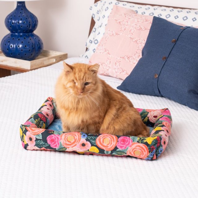
The dog bed has loosened up and GROWN a little. Is that possible? He seems to like it a lot now!
1,2,3 – Thanks for the feedback!
4 – I agree, but I can’t find the graphics I did with other fonts. Must. Fix. Now. It is SO not a Jane-style font. You caught me! 🙂
I think the dog beds kind of squish around a little as they get “broken in”. Emailing you.
I really like the new colors (the green, blue, and white). I actually like the blue banner quite a bit, it’s fresh-looking. And I don’t think it’s too much white. 🙂
I love the new design! Very clean and professional! I agree about moving the nav bar under your header (totally missed it and had to scroll back up to find it). I also agree with a previous commenter about cutting back on the categories. As a fairly new reader, it is a lot to scroll through. Maybe use categories for broad topics and use tags for specifics? Overall, I think the new look is great!
Hi! I love seeing the different versions you’ve come up with so far. I had emailed you last summer with a variant of your logo based on the last time you’d mentioned wanting to tweak your logo, but hadn’t seen anything new pop up on the blog. I’d be more than willing to help fixing the resolution of your logo – just send me an email @ beverleymade@gmail.com!
i totally did my blog redesign in front of all my readers, b/c i didn’t know how to do it on the backend only, lol. and it’s not the worst thing!
i really love the negative space, i think it’s clean. i would also move the categories. it’s seems like a long list on the sidebar, you could condense them or make drop down menus in the header bar under your banner.
i love that you added building a handmade business! i really look forward to reading those posts.