As of last week I’m officially starting over with decorating our guest room. Also, I’m here to remind you to always buy a paint sample jar before springing for the whole gallon.
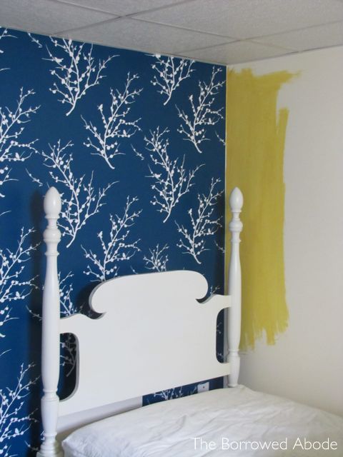
When I answered my latest Reader Question on the blog, the one where I discussed the pros and cons of white furniture against almost-white walls, I decided to paint the non-Tempapered walls of our guest room a bold gold. My hope was that this would solve the white-bed-frames-blending-into-the-walls issue that I was struggling with.
Shortly after hitting “publish” on that post, I beelined for the Home Depot where I impulsively bought a gallon of my golden yellow paint of choice. They were sold out of the Behr Paint Plus Primer that I swear by, and I had to do it RIGHT NOW, so I settled for Glidden. I haven’t used that super-cheap paint since my penny-pinching college days . . . but I figured it would be good enough.
I never got to find out how the paint compared to Behr, because the next day when I went downstairs to check the sample swatch I’d painted on the wall, I knew I didn’t want to cover the walls in yellow.

There are three reasons why it won’t work for us:
–>While the bold gold and teal color combo could really rock in a room, I think the guest room, which is primarily a bedroom, should be more soothing and calm.
–>Also, a home’s rooms should flow from one to another, and our home is pushing the limit with that concept. Our guest room is connected to our basement rec room, where the color scheme is (supposed to eventually be) blues and greens with a hint of orange . Walking from a blue/green/orange room into a yellow gold/dark teal room would be jarring.
–>Finally, we rent our home, and I don’t want to paint any more bright colors. We’re lucky in that our landlord allows us to paint, but when we do leave we’ll have to paint back any rooms that are too colorful. We’ve already got mango walls in Ryan’s office, lime green in my office, and olive green in the living room. We need to stick to neutrals for the rest of the rooms.
So what’s the new plan?
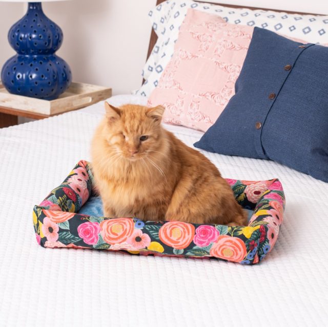
I’m taking the Tempaper down and finding a light gray paint for all four walls. Once that’s done, I’ll bring bold pops of color into the room with accessories and linens. It will be a good exercise in rental decorating!
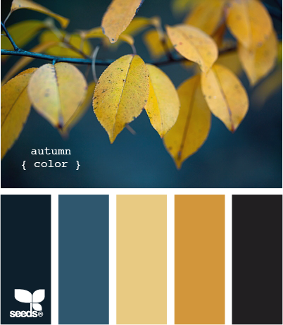
Here’s one color palette I’m dreaming of – just replace the black hues with a pale gray and an even darker teal.
Before this I was trying to choose a paint color that would work with the teal Tempaper and be dark enough to contrast with the white bed frames.
I think the dark teal accent wall backed into a corner, so even though I spent $85 on the Tempaper accent wall last December, I’m ok removing it. For the last few months I’ve been feeling in my gut that the accent wall was making things too difficult, but I didn’t want to take it down and “waste” the money I spent on it. But now, 9 months after installation, the room still isn’t decorated – because I couldn’t come up with a solution that I loved.
That’s a sign.
I think I’ve learned an important design lesson here. When a design choice you’ve made isn’t working in a space no matter how hard you try, it’s important to allow yourself to remove that choice and start again. Don’t force yourself into a design just because you’ve spent money on something and you don’t want to “waste” it. It’s more of a waste if you force yourself to live with a poor design just because you didn’t want to cut your losses.
Think of it this way: If you spend $150 on a funky sofa and half way through designing with it you realize it doesn’t work, do you want to get rid of the sofa and lose the $150? Or do you want to spend an additional $500 trying to make it “work” but never loving the result? Then you’re out a total of $650 AND you don’t even love the space!
So to recap today’s lessons:
- Always buy a small sample jar of paint to test before springing for a gallon.
- Sometimes decorating ideas do not work out. So no matter how hard you try to make things work, if your gut is telling you it’s not working out, you might want to listen to it.
Sidenote: This is not a reflection on Tempaper, because their product is awesome. I would have left it if my guest bed were going to be centered on the accent wall. Then the white furniture would have stood out. Alas, that is not the case.
Have you ever had to rewind and redecorate because a design decision didn’t work out? Come on, tell me I’m not the only one! 🙂
Ps: Today’s the last day to enter last week’s giveaway!


10 Comments
I love that you are honest about what does and does not work – I love seeing your sucesses (office! wedding invites!) but you never hesitate to tell us when something does not work. Please do not be discouraged by some of the things going on (the living room furniture not working out, revising the etsy shop, this). I am so refreshed to see that you are realistic about your limits and what does and does not work instead of trying to force it or stand at the top of the mountain and say, “I can do EVERYTHING! ALWAYS! MY LIFE IS PERFECT!” You know, the typical design blog rhetoric. I love your blog. I thought it was high time I commented. 🙂
Hi Lindsey,
I really, really appreciate your comment. It’s nice to hear that you appreciate it and I do always keep it real, because I too see many blogs that are always so shiny and pretty and perfect and I think to myself “how is that possible?” At the same time, it’s so easy to compare yourself so I have to keep that in check too. 🙂 Anyway, thanks so much for your feedback!!
-Jane
I love shiny and pretty but sometimes that is not real life. Comparing ourselves is what we do, I think. As a species, as a culture. I love Pinterest, I love blogs, I love design. But sometimes it’s madness. 🙂 So again, love that you are real. And I am currently repainting my bathroom because I did NOT get a paint sample. I feel your pain. 🙂
Such a bummer! That paper is so cool. But, it really is important to recognize when a design decision isn’t working out. I have a similar situation in my office — I made a design decision that I thought would stretch me out of my box a little, but a year later haven’t finished decorating because I’m stuck. Once the kitchen is done (and all the kitchen stuff moved out of that room!), I’m going to fix it. This is a great post — so honest. And, I’m looking forward to seeing your new direction 🙂
I’m actually going through this right now… bought a pretty “gray” paint color for my bedroom – its more blue and not what I was going for at all but I feel like I have to live with it because the paint was so expensive! 🙁
Thanks for another timely post! It’s always good to remember that we must give ourselves permission to substantially alter or scrap projects altogether that are not turning out well even if it involves “wasting” money already spent on them since trying to force an outcome seldom produces a positive one 🙂
I am tooling up to go all “Spanish Savage” on our kitchen and paint it bold gold (love that name!) with some adventuresome accent colours for the trim and cabinets, and will now definitely try it out on a sample first!
Our landlord has been very generous in giving me free rein to do major alterations on our unit (half of a duplex), and I am fervently hoping I won’t have to do the whole thing back in “cheap apartment off-white” at the end of it. I’ll definitely leave a couple 5-gallon buckets of high quality primer if we don’t, tho 😉
such a bummer about the tempaper because I REALLY love it, but like you said, sometimes, things just don’t work. Better to cut the losses. I’m still trying to work on this with the hubby. Once he does something, he likes to stick with it… end. of. story. Me, I’m more of a free-flowing, tweak-things kind’a girl. We have to joke about it all the time! Glad you’ve decided to make the change to make it work for you guys!
Ah, the joy of marital decorating compromise! 🙂 Fortunately in the guest room Ryan sort of handed over the reins to me a while back!
[…] now that I’ve decided to go with simple light gray walls instead of the bold teal accent wall, that means that I can get away with more bold furniture statements such as this one! I am so […]
[…] yellow paint around the window (above) and by the accent wall (below) is the mark of an unfortunate whim, when I thought that a mustardy yellow would look good on the walls. Shortly after starting to […]