This post is a belated one written primarily because of my mother, who ever since we got home from our honeymoon/vintage-furniture-registry-pickup has been eagerly stalking the blog to see photos of our new (long-awaited) dining table.
The reason I didn’t post photos of our finally-somewhat-furnished dining “room” sooner is because I’m not satisfied with it. But maybe you guys will have some good ideas? Sometimes an outsider’s perspective can be totally different.
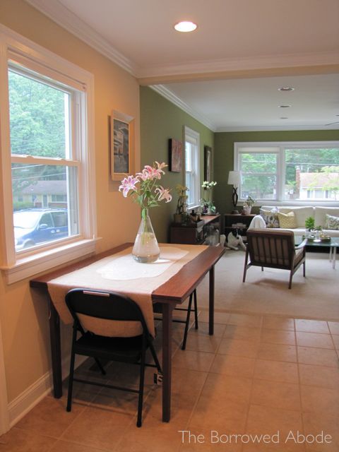
Please disregard the black metal folding chair in the photo. As soon as I get a chance to refinish the vintage dining chairs I found in the trash, they’ll replace the folding chairs at the table.
Before I whine about our ongoing space layout dilemma, here’s a few more shots of the awesome extendable table. Remember how we almost caved and bought a brand new table because so many mid-century dining tables were too short for Tall Ryan to sit at comfortably? This one worked perfectly, as we discovered on our honeymoon visit to Just L.
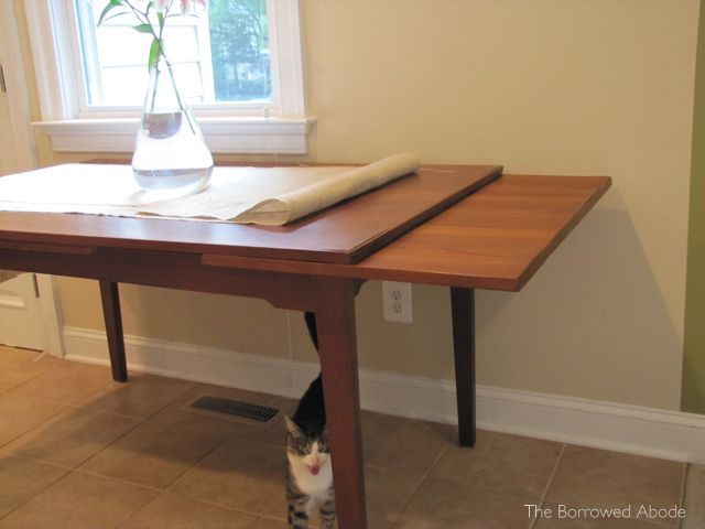
Instead of having a split down the middle of the table top where you insert table leaves, the leaves slide out from below the table on either end, and the middle top drops into place. It’s so cool how it works. Maybe I should make a demo video for you.
Here it is with only one side’s leaf extended. With both leaves extended we could definitely seat 10 for a dinner party. Or Thanksgiving feast. Hurrah!
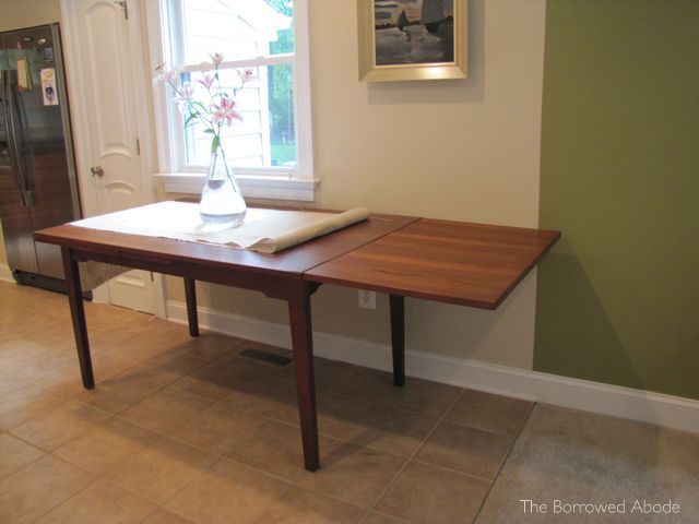
As you can see above, even with one leaf extended the length won’t fit in just the dining area. We’ll definitely have some living room dining creep going on when we host larger gatherings.
Now on to our First World Problems: We have tried three possible dining room layouts, none of which leave me loving the look of the space.
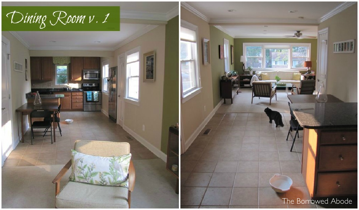
We tried this first layout, with the table pushed against the same wall as the large island with overhanging counter. We weren’t a fan of it, though, because it left the rest of the space just so weirdly open.
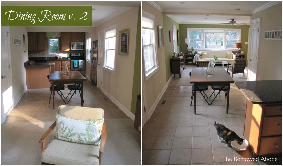
This layout is most aesthetically pleasing to me, but it still annoys me because the overhang of the counter really messes up the symmetry of the space.
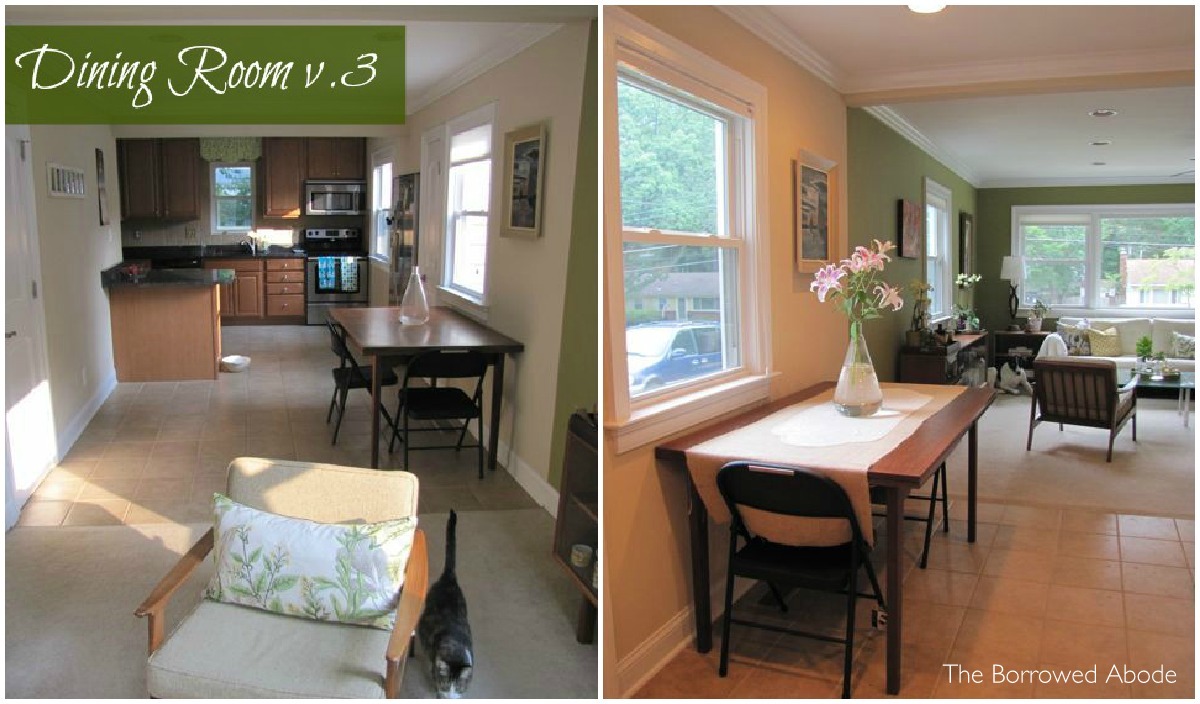
This is the layout we decided to go with for day-to-day life at the abode. It keeps the path from the living room to the kitchen nicely open, but it’s not as ugly as version 1.
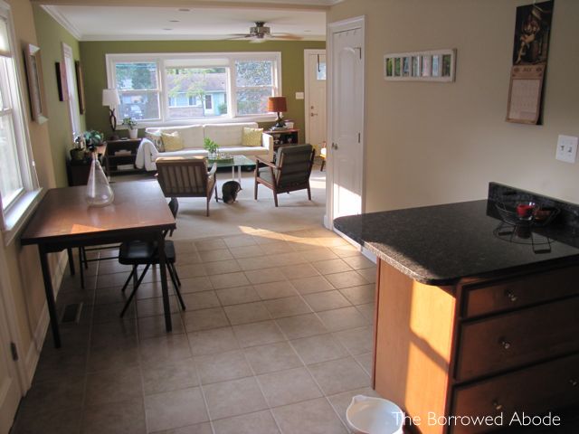
This is definitely the most spatially-challenging area in our entire house. But like I said, first world problems.
Maybe the space would look better with a rug?
Which version do you like the best?
PS: Notice the cats in all the photos? They seem to have a sense for “oh, mom’s taking photos for the blog! Let me get myself in all the photos!”



15 Comments
Against this wall definitely makes the most sense. I would see what you could find to put on the opposite wall to make it feel more balanced. Perhaps a skinny sofa table that you could accent with something tall? Even a large mirror on that wall to reflect the light from the window and make the space seem bigger. Or some long decorative shelves?
Hi Blythe, thanks for the comments!
I forgot to mention that we’ve been collecting photos and art to frame and hang on the opposite wall – building a collage art wall around the last-name photo art that a good friend gave us for our wedding. That’s on the wall now, waiting to be added to. We wanted to get the table first. I think that will help.
I agree that that side needs something. I don’t like to add furniture that I don’t really need, and we don’t have a need for a side table there – but maybe if we added bar stools to the counter and hung up the collage wall it would help add balance. That’s also why I was thinking a rug would help. I’m going to think about the balance idea more, though. Maybe we could even do a tall potted plant, like a tree, that could be easily moved out of the way when we move the table to the center of the room for dinners with guests.
Thanks so much!!
-Jane
Version 3 but have the short end against the wall (under the window) and the long side towards the middle of the room.
I was wondering why you (Jane) hadn’t tried this layout. I realize it wouldn’t work for a big party for for day-to-day just the two of you, my guesstimate on length/width says you will still have a path to the kitchen. And visually the dining table will appear to be in the dining room just like version 2 instead of pushed against the wall.
We tired it this weekend but alas, too clumsy feeling for me. It sticks out past the island so you end up feeling like you have to wind your way through. . . I’d surely bump into the table a ton. 🙁 Thank you for your comments though!!
Thanks for the idea! Another person suggested it too, so we tried it this weekend but even though it looked ok it felt totally awkward like we had to go through a winding route to get to the kitchen. I’m so clumsy even in an empty room that we decided it would be a recipe for disaster to have it sticking out. But we may do that if we have one or two dinner guests. Thanks!
Does it work perpendicular to the wall? Otherwise I like it in the middle of the room best.
And yes, it needs a rug, preferably one with colour to define the space
We tried perpendicular this weekend but it felt way too ‘in the way’ for us. I guess this room will just have to remain imperfect. But I totally agree – we’ll keep our eyes out for a rug that fits the space well.
My first thought was also centered, but with the table rotated 90 degrees from Version 2, or if that was too cramped to push the short end of table against the window. I think having the table in the center of the room helps define it as a dining area, and reduces the awkwardness of the two of you sitting at the table without being able to sit across from each other. I realize you’re dealing with a small space though! (We have the opposite problem – we have a big dining room and an enormous dining table and it always feels strange to have just the two of us eating at a giant table! I grew up with a dining table very similar to yours – a teak one with the same leaves that slid out. My mother offered to give it to us, and as much as I love it, it was still too small for our space. I really miss having the flexibility of the leaves, though.)
I think version 3 looks the best but needs a piece of furniture on the opoosite wall to balance things. Something like a sideboard.
My other suggestion was to turn the table, but I see in the comments that you tried that already! Definitely an awkward space to work with!
I totally agree that a piece opposite it would really balance it out, but the space is so narrow that we’d have to then move the furniture (sideboard or whatever) out of the room if we moved the table into the middle to seat company for dinner. So that’s out. . . but since I’m reupholstering some fun chairs for the table, maybe I could set them against the wall opposite the table when they’re not in use – that way they’d provide balance but not be extraneous. . .
Thank you!!
i like the table in the middle of the room best… my suggestion if you dont like the over hanging counter you could build (or find to fit) a shelf that would face out toward the door on the other side and it would add storage
where did you get the table with slide out leaves?
Please give information about the table. It would be perfect for our needs. Where could I see it?
Hi Gail, we found this at Just L, a mid-century store in Littleton, NH. If you look for “hidden leaf midcentury dining table” on ebay or etsy you may find one!