We have 8 days in which to make our home presentable for a small dinner party. Or something of that sort. As usual, I seem to have bit off more than I can chew, by deciding we *must* finish painting and decorating the bland living room before this happens. Oh, and did I mention that Saturday and Sunday are non-project days, as we’ll be busy celebrating Ryan’s 30th? So in reality I have 6 evenings and one day (Monday) to get this all done. So if I disappear from the blog, that’s why.
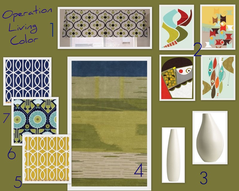
So I’m in a hurry to wake up the living room, but don’t want to waste money on poorly-planned purchases that I’ll later regret. How to avoid this? I created a mood board. Keep in mind this may not be exactly what we end up with. It’s just a guide that does the following:
- Shows Ryan my ideas, so I no longer have to explain what a “box valance for the window” is, or what a “navy and white geometric pattern” looks like.
- Puts all my ideas and inspiration in one place, so that I can be sure they all work together.
So here’s the moodboard, as well as a detailed explanation. And finally, I have a question – your opinions are wanted!!
Here’s the moodboard breakdown:
1. Window Valance
Although the large windows are pretty all on their own, I think that adding some window treatments will help the room feel more coordinated and “finished.” (I don’t dare write “pull the room together.” Ryan’s ruined that phrase for me.) We don’t want to do curtains because they would all be hanging behind furniture, and I think that would look silly. Instead I’d like to build small box valances to cap each of them. I think that will add some visual interest and height to the decor. I’d like to use one of the fabrics shown. (6 or 7?)
I am inspired by the valance shown, which I found at The Reluctant Blogger.
2. Wall Art
Ryan and I still need to agree on some art for the empty back wall of the living room. It’s the first wall you see when you walk in the front door – and it’s driving me crazy to have it bare! I’m hoping I can convince him that two of these mid-century style prints from Jenn Ski on Etsy will fit the bill.
3. Decorative Crap
I don’t own many decorative objects. It’s great from a simple living standpoint, but can be annoying when I’m trying to decorate a room with finishing touches. I did, however, remember that I have two large white West Elm vases (thrifted, of course) that would add some good decorative interest against the newly painted green walls. Now I just have to figure out where I can put them.
4. Area Rug
Ryan and I both love the Lagoon Rug at CB2. Ryan loves it because it looks like there is a Brontosaurus on it when you look at it sideways. I love it because it’s a thick wool rug with gorgeous colors woven in an interesting shape. Originally I wanted to put it in our dining “hall”, but neither size will work there. Now I’d like to purchase the 8×10 for the living room. It’s $550, so this will not be happening in the next two weeks, but maybe in the next 2-3 months.
Fabrics / Color Palette
With our all-white seating against the olive walls, I thought that accent colors of olive, navy, and yellow would work well. Between window valances, throw pillows, and the wall color, I think we’ll have kicked that all-neutral blandness in the butt!
5. Dwell Studio Bella Porte Citrine
6. Joel Dewberry Modern Meadow Sunflower
7. Dwell Studio Bella Porte Twilight (not the movie)
So there you have it. My grand plan for some living color. The only thing I don’t feel totally confident is my choice of fabrics.
I think the best fabric for the window valance would be #7, the navy/white print.
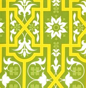
I’m not sure that the Joel Dewberry fabric (#6) is right for the space at all. I’m wondering if this Joel Dewberry Deer Valley print would be a better match, with its lighter and brighter colors:
I found the fabric used in the box valance pictured. It’s the Logan Home Decor Blossom Lime. Maybe that would be best for my box valances, because there is more white space, and it incorporates the wall color along with the navy. Or not. looks like it’s green, white and black. Hmm.
You guys always have great input. What do you think?
PS: My posts may be spotty for the next week, but I’ll be working hard on projects and will have tons to share when they’re done!!


14 Comments
Exciting project! I LOVE your mood board. The colors you’ve chosen are so fun! I super duper love dwell fabrics and am excited to see how you incorporate them here. And I actually really like fabric #6 and think it’d look great in the space.
Your plan sounds so awesome! The accent colors really had me sold.
Any plans on where you’ll put your coffee print?
Thanks for the intro to a very cool etsy shop, too!
Katie
#1 Love the idea of a valance! I think you’re right, curtains might be too much but a valance would balance it out. Hey, that rhymed!
#2 LOVE the wall art. Kudos to you for finding such awesome prints! Definitely would bring a lot of color to the room!
#3 Those vases would be perfect. You could put sticks/branches in them to bring in some natural elements too! On the plus side for that, it will give your BF some more fodder to make fun of. =)
#4 The rug is perfect. I love it.
#5 I really like the fabrics you chose! I think the navy/white fabric would be good for the valance because it has some substance, the other fabric is so pretty but it almost looks more like it belongs in a kitchen (but if you like it, I’m sure it would be awesome too! Just my opinion of course). If you chose the navy for the valance, I think that the dewberry fabric would balance it out really well. The 2nd fabric on your mood board is really gorgeous too, but the dewberry would pull in lighter colors and gives off less of a “matched” vibe.
I seriously can’t wait to see how it all turns out! Good luck with the quick makeover, I think you will do great!
Thanks so much for the detailed feedback! How fun that we’re both doing major room color splashes at the same time 🙂 I’ll be sure and tell Ryan you’re egging him on 🙂
I love the original fabric, but I thought 7 was best too. Could you add some thick coordinating green ribbon at the top of the valance or something to tie in the green?
Christina @ The Scrappy Housewife
Oh! What a great idea – why didn’t I think of that? Thank you!
I love the fabric #6 but I don’t think it’s the best choice for the space. I think that the blue geometric is the best and I like the idea of adding a coordinating green ribbon to it. I really like the colours that you’re using and the art prints!
Very nice mood board, and I LOVE the brontosaurus rug. I could easily live with one of those.
Now you knew I’d prefer the Joel Dewberry Deer Valley print- those colors are wonderfully vibrant! They’d definitely wake the room up.
Nothing like having guest over to light the fire under a project. I feel like #7 is the best pick.
Nothing like having guest over to light the fire under a project. I feel like #7 is the best pick.
loving number 7 and how it should work with the room! hmm… we can pow wow when you get back! =)
Love it! The colors and patterns are very “you” Jane! 🙂
i do like #7 the best.. very fresh & clean.. perfect for waking up your space! i also like the coordinating fabrics 5 & 6. that along with your art.. should be just enough movement, to create the interest you’re after! 🙂
[…] 33 Before 33 « Launched: Operation Living Color […]