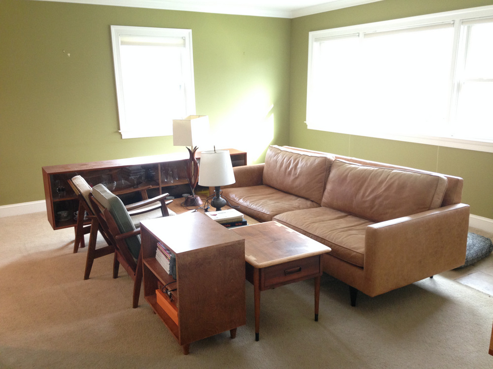
On New Year’s Weekend of 2014-15, Ryan and I discussed changing the paint in our living room. We’d enjoyed the Tate Olive accent walls for several years, but after reupholstering the sofa in brown leather, replacing our white chairs with wooden ones, and switching out the glass and chrome Barcelona table for a baby-safe wooden coffee table, the whole room was looking too earthy and drab.
Case in point:
 Ryan had the genius idea to go with a dark gray. It would contrast nicely with the teak wood and caramel leather tones. We looked at paint swatches and then . . . well, we had a baby and everything took 5 times longer to complete.
This year, as New Year’s Day loomed, I decided that it was time to paint. The paper swatches had been sitting out for a year.
Going gray in the living room meant we’d have to repaint the rest of the open-plan living areas, because the dining room, kitchen, and hall all flow together. They are currently “builder’s beige,” which was great 6 years ago but drives me nuts now. And the pink-undertone beige does not work with charcoal gray. Add in the orange-brown cabinets, the beige tile floors . . . and you’ve got a lot of brown tones going on.
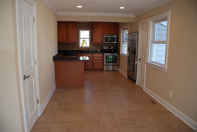
So . . . over the holiday we painted, starting with the charcoal walls of the living room. Sunday morning we woke up and were disappointed – the charcoal gray with blue undertones looked way too blue in the morning light. (It actually looks more neutral in the photo than it did in person.)
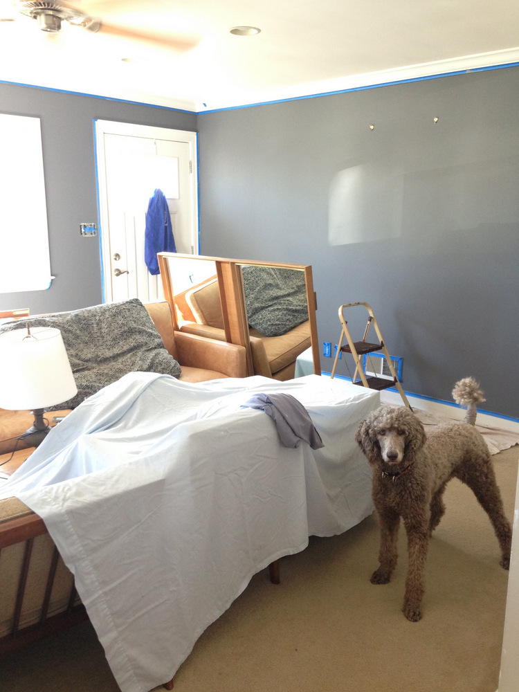
The walls appeared to change color as the day progressed. Our living room gets a ton of light all day, thanks to its exposure and large windows. That’s how we knew a dark color would work. It makes it really hard to get a consistent look from colors. In the evening the walls looked like just what we wanted – a dark charcoal gray.
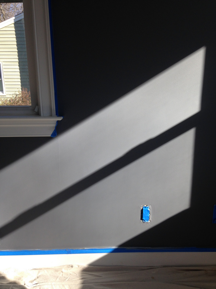
Ryan and I are currently perplexed. The color we ended up with is a medium gray, and it looks pretty with the brown furniture. But it’s not the dark, dramatic, modern look that we were aiming for.

We tried two darker grays yesterday afternoon, and one clearly had brown undertones – so that’s out. The other is a darker version of what we just covered the walls with and complements the caramel leather well.
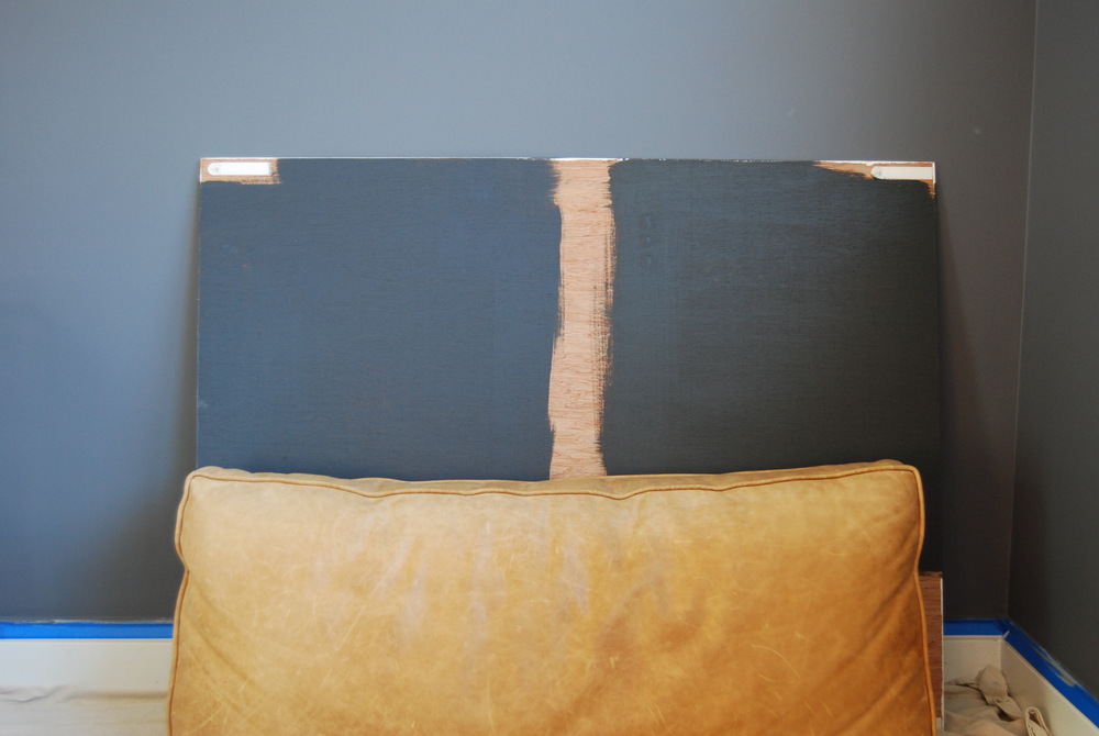
Today I’m going to start painting the other walls the pale gray. It’s possible that covering the builder’s beige will help us make a decision on the dark gray living room.
Either way, it feels really good to get back to decorating after a busy holiday season with Janery! It’s always been my favorite way to relax.
PS: I created a new Instagram account for the blog, where I’m sharing more real-time updates and snips of real life. You may have noticed that the Janery IG account is being used primarily for my business, so if you’re more into the blog, come follow @TheBorrowedAbode on IG!


No Comments