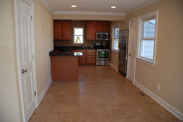
I have been struggling with how best to use the dining room/kitchen wall space for the three years we’ve lived in this house.
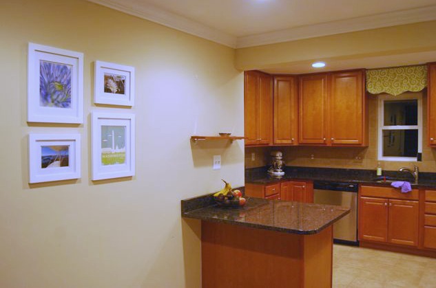
In October I thought we’d finally come up with a solution: A small gallery wall in the left side of the dining area (below), and a shelf over the random kitchen island on which to display my awesome collection of vintage cream pitchers. 
(Sidenote: I have no idea how I ended up collecting vintage cream pitchers. But I do love them.)
We looked at all the different shelves online. Photo ledges – too narrow. Chunky floating shelves – too many complaints about sagging and instability. Regular shelves – too bracket-y.
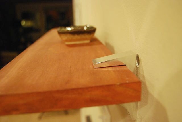
The Container Store came to our rescue with an awesome set of shelf clip brackets. They’re sturdy enough to keep the shelf supported well, but low-profile enough to work with our existing decor.
I saved money by using an existing board from my stash in the basement. I stained it a few times, adding different stains until it was practically the same color as our cabinetry. I was pretty proud of my color-matching ability.
 In the photo above, you can see where I hung the shelf over the island.
What you can’t see is how it was such an epic failure.
For some reason my anchors wouldn’t lodge in the wall, so the shelf was just hanging on by a thread. I think I needed longer anchors, for thicker drywall, but I didn’t feel like going to buy some right then.
So it sat there for a few days, and do you know what? I realized that I didn’t like the shelf there. It felt too random. Ryan agreed, and we decided to just extend the gallery wall concept for the entire stretch of that wall.
It’s annoying that I have to patch the wall now, and then touch up the paint – but sometimes you have to just try a design idea in order to know it’s not the right one.
Now we have a bigger challenge: Ryan and I have to agree on some more art for the gallery wall!
And because January is the month of “finishing abandoned tasks,” I have to at least get the frames hung.
Have you ever had a total failure with wall anchors? I didn’t realize that drywall came in different thicknesses.


6 Comments
I am so surprised you are allowed to do this sort of stuff in rentals, in Australia, no-one would dream of putting up a shelf.. sure you could ask the owners but most of them would say no.. I wish I could do stuff but my husband says no we are not patching anything up before we leave.. (ps you are probably best with the floating shelf idea on these type of walls).. look forward to seeing the gallery..
Hi Amanda!
That’s interesting – are you saying in Australia you’re not allowed to put holes in the wall? Yikes! Now i will admit that I felt horribly guilty after the shelf didn’t work out, because I had made those holes. I’m going to patch them and repaint with leftover paint really well, I’ve done it before – but I can see why a landlord wouldn’t like that. I didn’t actually ask my landlord, we’ve been here 3.5 years now and he’s really reasonable. My thought was that if we installed the shelf, and I had stained it to match the cabinetry, it could stay for the next tenants – although we don’t plan to move out anytime soon!
How long are you in your rental for?
I love this post. I try DIY projects/ideas all the time that do not work out-thanks for the honesty and good luck finding a solution you like better.
I can confirm – in Australia you’re not allowed to put holes in the wall in rental places – that includes putting up hooks for pictures as well. Most of us who put up pictures (and don’t have picture rails) put them up with 3M adhesive picture hooks that can hold up to 2kg. Although I’ve still had some painting falling down breaking the glass adventures with them. And generally you can’t get permission to paint or etc.
Your long room kitchen/dining is one of those difficult to decorate rooms, because all the lines draws your eye up to the kitchen cabinets and the one lone window – which are not strikingly attractive. Ever since you had the picture of your what you were going to do with your table, I’ve been thinking about how I would handle it. And to be honest, I think I’d be looking at putting a circular table in there rather than a long table to break the lines. And painting one of the walls a stand-out colour as well to distract from the back. The Gallery idea is a great one. And you know, plain white frames on a painted wall looks great too – if you’re the type to like that sort of thing? Anyways, I’m looking forward to seeing what you do with it.
Kiri,
Thanks for the extra info on Australia rental restrictions. Yikes! Not even picture hooks? BTW, I use a lot of the 3M velcro picture hangers and they work really well. I don’t know if you’ve tried them at all for heavier frames.
You’re absolutely right about the kitchen – you said it better than I ever have. I don’t find the kitchen cabinets unattractive, but no one really wants cabinet doors to be a centerpiece. Other problem is the island sticks out into the dining area. We thought about a round table, which you’re right, would totally break up those lines. We ended up going with the rectangular since this is only a temporary (albeit 3+ years) home, and we were either investing in a vintage dining table / getting it as a wedding gift. So for photos it doesn’t look good, but when we pull it out and expand it for larger dinner groups, the good news is we can all get around it ok. Oh well, at least it’s a nice new kitchen
(PS: I just told Ryan what you said about the kitchen, and he asked “is she sure she doesn’t think that just because she’s upside down, looking at it from Australia?” 🙂
LMAO – I tried looking at it upside down – its the same effect! 🙂
Whatever you do with your kitchen, it looks way better than mine! I live in a 39 msq flat, that’s been divided into 4 rooms. (Um… that’s 422 sq feet) and the kitchen is 6x9feet. with a single door in the middle. All the cabinets are up one half, and the wall facing the window has both a pantry door smack in the middle and the wall has been painted magenta. When you walk into the kitchen the first thing you see is the fridge. There ain’t no way of tarting up my kitchen! LOL