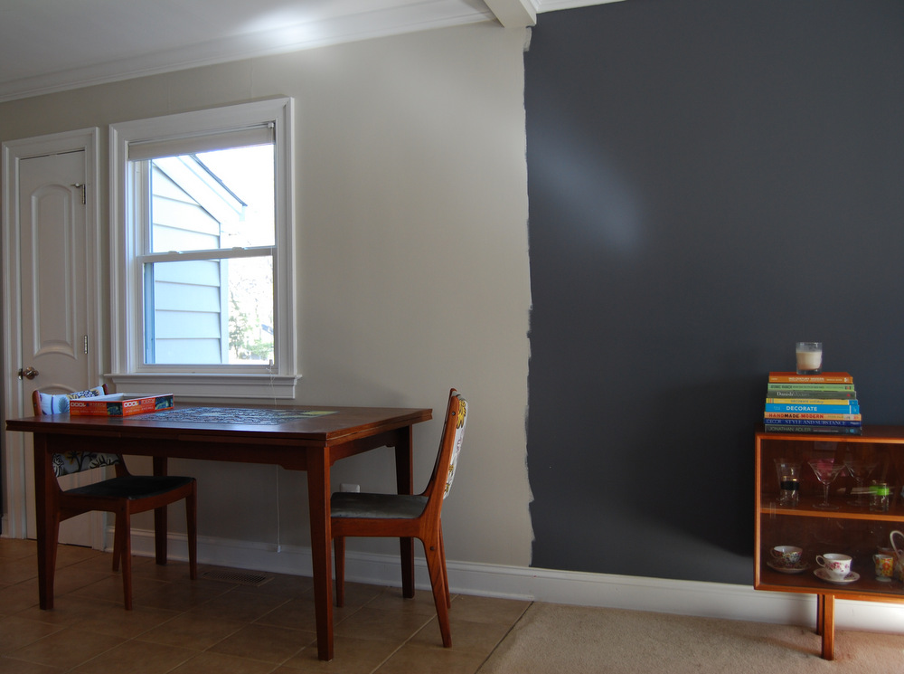
On Monday night I finished painting our walls in the final choice of light gray paint. I’d finished the first coat Sunday, and we thought we liked it then.
On Tuesday morning, as the light streamed in we liked it. On Tuesday afternoon, as the light moved away to a softer glow, we liked it. On Tuesday night, as the night sky came out and we turned on the table lamps we said “yep, we still like it.”
Finally. It was gray enough to not feel beige, and it was beige enough to not feel blue. It was dark enough to contrast with the trim, but light enough to not stand out.

Have you ever felt undecided and asked for people’s opinions, only to know exactly what you want to do once the opinions start pouring in? That’s how I felt about the pale blue gray I posted about last week.
When some people chimed in with “keep trying until you’re happy” I agreed with them. But when people pointed out how good it looked and said I should give it a chance, I found myself thinking “nope, can’t do it.” Ryan felt the same way. Maple didn’t care; she just wanted to know why her dad was keeping her in her room while her mom played with paint brushes in the hallway.
We tested three more swatches based on recommendations. I tested them on every wall in every room. One was immediately removed, and one stood out to us immediately.

L to R: SW Worldy Gray , BM Gray Owl, Valspar Filtered Shade
Sherwin Williams Worldly Gray (SW7043) – left – was the winner. It looks beige against the blue gray wall, and it’s more of a greige than a gray. The other two looked pretty, but we worried they could still reflect blue into the room.
In some conditions it looks beige, but in a modern way – not the bad “builder’s beige” of the 90’s. In other conditions it looks gray, but with slight green undertones. I would call it a “safe gray.” It’s beige enough to work ok with the kitchen’s fixed elements, but gray enough to feel fresh and modern on our walls. And it photographs neutrally enough that I can use it as a backdrop for styled product shoots.
I googled the color and found lots of results – it turns out I’m not the only one who likes this color for difficult painting situations.
We did sit with the blue gray walls for a few days, though, because life was busy. On Sunday night, when I finally got time to paint, we knew we were making the right choice.

I have one painting task left to do today – I just need to clean up the line between the living room and dining room. Next up we’re hanging art and photos on the wall. Instead of just randomly using what we have, I’ve been working on a plan so that I can be satisfied with the arrangement once and for all. Because of that it may take a few weeks to get everything framed and hung.
Thank you to everyone who chimed in with advice and color suggestions! It was really appreciated, as always.
New here? Here’s Part 1, Part 2 and Part 3 of the Great Gray Paint Debacle.


11 Comments
Whoo you nailed it!!! that’s such a good color gray! it’s perfect for sure!
Thanks, Erin!
It looks great – hooray!
Thanks!
You are such a trooper! I think it looks great…even though I loved the blue-gray, too!
If I’ve learned one thing from you it’s to take my time and get things right 🙂
That color works so much better! I’m glad you didn’t give up!
Thanks, me too! A good lesson in patience and perseverance.
Looks great!
What color is the darker blue gray wall on the right?
I lost the swatch after I painted it so I have no idea! I can’t believe it 🙁 But I also liked Sherwin Williams Cyberspace – it was very close to this one. Hope that helps at least a little.