Monday, when I shared my update on the hunt for a perfect dining table, I loved how so many of you were quick to chime in with great ideas and advice! Seriously, it’s one of the things I love most about the blogging community – the way we’re able to share ideas and collaborate.
The funny thing was, once I asked for ideas, and as I responded to the comments – I realized just how set I’d become on the idea of going to a store and buying a table just to get it over with.
So I’d like to briefly apologize to all of you who went to the effort to share ideas. Because I feel bad that I’d already made up my mind – I just didn’t realize it at the time. :/ Oops!
Several of you suggested using that we build our table to suit our space and our needs. Ryan and I had tossed that idea around a while back, because we do love the fact that we can create just what we need if we want to. But we decided against building for a few reasons:
- We’ve got several pieces of furniture that we really, really want to build – simply because there is no other perfectly customized option out there. I won’t spill the beans on what they are just yet, though. Suffice to say that we just don’t have the bandwidth to add another building project to our list, especially between now and our wedding in 2012.
- If we built a table, I’d really want to have the top as one huge solid piece of wood . . . and a piece that size would be very expensive.
Anyway, I think we’re going to buy a table, and buy it new no less. But that means we’ve go to figure out how to make it work in this somewhat awkward, small, and narrow dining space:
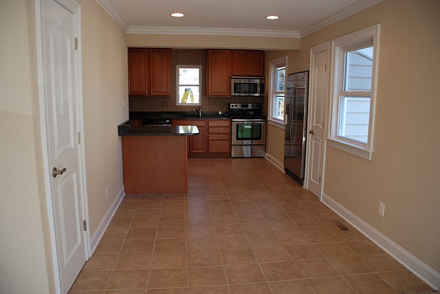
To figure out which table sizes would work in the space, and where they’d work, I grabbed my painter’s tape and tried out a few options:
Option 1: West Elm Expandable Square Table – Flush against left wall
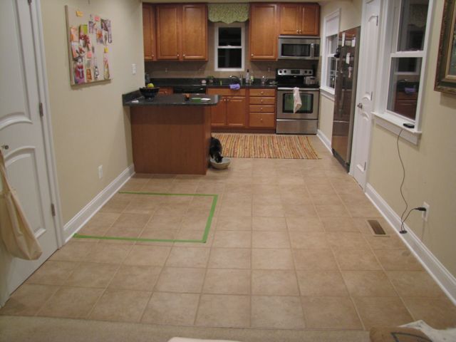
The space, which also serves as the walkway from the living room to the kitchen, is 8.5 feet x 8 feet. It’s made more tricky by the fact that the kitchen island’s counter hangs over in a sort of “breakfast bar” fashion. That, combined with the presence of the coat closet door, has this option looking a bit too close for comfort.
Option 2: West Elm Expandable Square Table – Near left wall
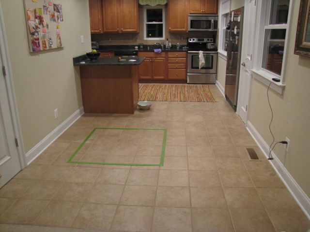
Eh, this just wasn’t doing it for me. If it’s going to be pulled away from a wall it might as well be centered. But if it’s centered, then we’ll have to walk around it all the freakin’ time. NEXT!
Option 3: West Elm Expandable Square Table – Against right wall
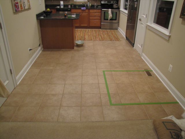
Moving the table to the right wall seems to be the way to go. Feels easier for us to work with on a day-to-day basis. Of course, when we have dinner guests, we’ll pull it out so it’s centered in the space.
But the square against the wall isn’t my favorite. And it comes out pretty far – about 42″.
Option 3: CB2 Mango Wood Table – Against right wall
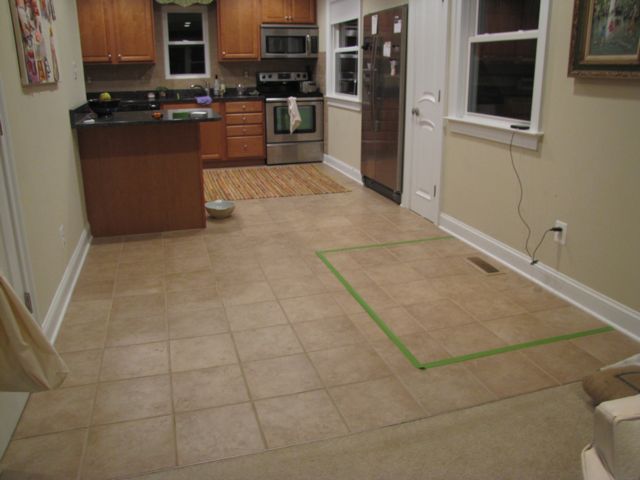
This table seems like it may fit the space better, as it would only stick out 36″. Also, I like how the rectangular shape sits against the wall much better than the square shape.
Of course, we could do this layout with either table. It’s just that the more I think about the West Elm Expandable table and the fact that it’s engineered wood with a veneer, it doesn’t seem like the sturdiest, most durable choice – and it’s certainly not as eco-friendly as the solid Mango wood table from CB2.
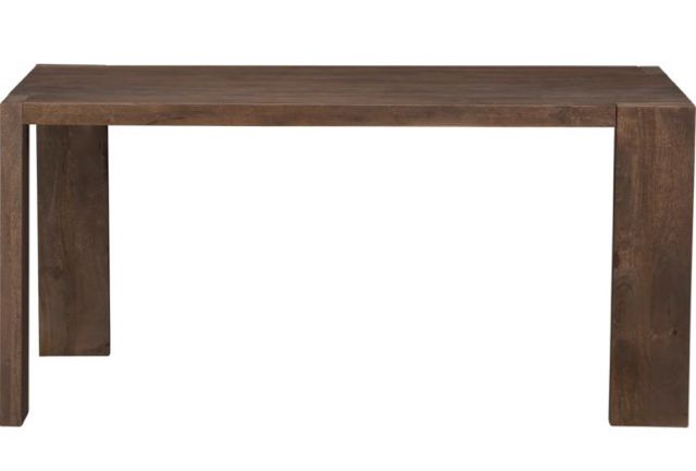
CB2: Blox Mango Dining Table. $499
It’s funny, you wouldn’t think that a rectangular table would work better in the room than a square. . . but I think it does just that.
Anyway, if you’re still with me, this is how we go about figuring out and testing furniture layouts, especially in awkward spaces.
I think we’ve tried all possible furniture layout solutions, but are you seeing another option that maybe we missed? I’d love to know!
PS: You may notice that, in the background of these photos, there’s some mess in my kitchen. I didn’t fold and straighten the dish towel that hangs on the stove. It’s now driving me crazy in each photo. But you should be flattered – we’ve been together so long now, you readers and I, that I am finally feeling comfortable with letting you see a messier view of everyday life in the Borrowed Abode. 🙂


10 Comments
Dude, bar height round table. But I’ve never been one to buy a forever piece, thus a suggestion you may not want for your next home. heh.
Bah! I love the towel. 🙂
I like the last photo best. I think a rectangular table would also be more versatile in the future. 🙂
Just so you know… most tabletops are not a solid piece of wood. They’re usually boards joined together. If you knew someone with a joiner and a planer you could glue some boards together. The tricky part is just matching the grain so it looks like one big board. 🙂
Sounds like you may have finally settled on your new table! YAY!!! It feels good to make a decision. The right wall with the mango table does seem right especially since chairs will add at least another six inches, pushed in, or so. I only other option I can thing of is a table that ends fold down, but if you plan on using it regularly I wouldn’t be ideal.
Your kitchen is hardly a mess! Besides a cute animal in pictures cancels out any towel problems any day. That’s what I’m banking on or I may have to take my Fall Kitty post down. 🙂
Haha, I know how you feel! Almost every photo I take I notice something amiss when I post it on the blog… ah well. =) We have a weird layout in our kitchen/dining room, and i’m still not happy with how our table is situated! I don’t have any brilliant advice, but I hope you find a table and a layout that works well! I’m pretty positive you will make it happen. =)
Looks like you nailed it!
I think the last option seems best too!
It’s funny, when I looked at that space I immediately thought “rectangular table”. Our dining area is also more of a pass-though than a room, and is works so much better to have a rectangular table than the round one we had (even with the hutch on one side of our dining area). It probably helps that one side of the table has a bench instead of chairs.
Looking forward to seeing what you pick!
I use painter’s tape to plan my furniture layout too! My husband thinks I’m crazy but I like to see the space I’ll “lose”.
[…] into the dining and kitchen areas, contributing a loft-like feeling to the main floor. It was challenging to find a dining table that fits comfortably in the space, which is short and […]