Today I’m taking you on a virtual tour of an amazing 1950’s style home in Hollin Hills – one of the paces we toured during the Home & Garden tour on Saturday.
Out of the 11 homes we toured, House 4 was one of my favorites. Before reading the notes on the home, I had deemed it the perfect retro home – because it manages to play off the kitsch and quirk of atomic style without going overboard.
It turns out it won the Washington Post Mad Men contest, with judge Vern Yip (from HGTV) saying it was “both faithful to…and updated from…what you would see on Mad Men.” Exactly.
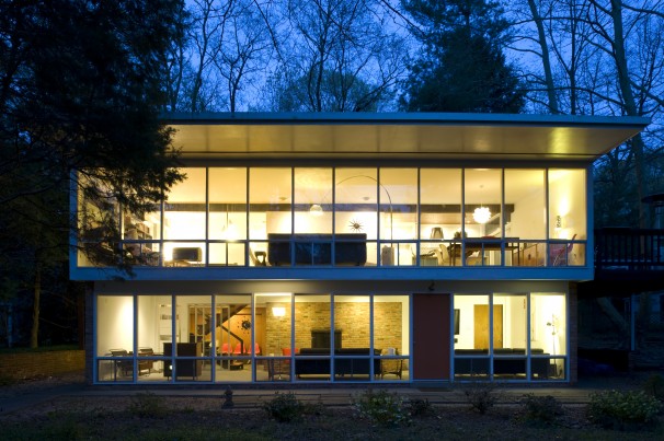
Credit: Washington Post
This house was one of the architectural styles I loved most in Hollin Hills. It’s essentially a big glass box in a layout that I’d love to have someday.
My photos won’t be perfect, because I was trying to quickly snap them without getting in the way of the other visitors, but I think they’re good enough to get the point across. 🙂
We entered through the front door on the first floor, but I think the door was only there to lead out to the garden and patio. The true entrance was on the side of the house.
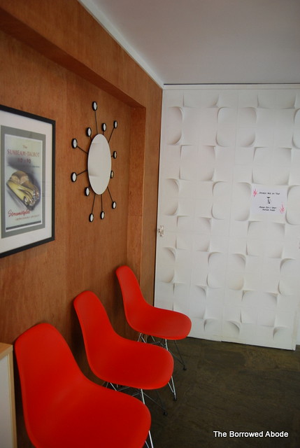
The lounge room on the bottom floor runs the length of the house. The owners were smart to use the retro wallpaper on just one wall. Every wall would have been overkill:
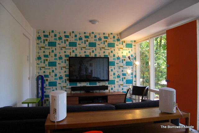
The other end of the long lounge:
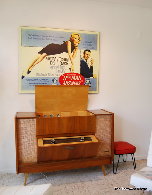
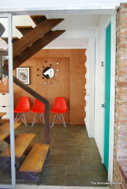
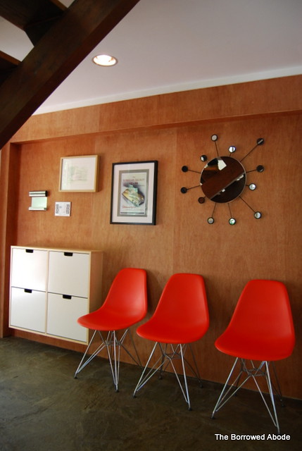
Behind the lounge on one side was the entryway and stairway.
Plywood looks great when used as walls and cabinetry in mid-century homes. I love that – so practical and affordable.
We couldn’t enter the lower bedrooms because of cats, but I noticed that the owners installed Wall Flats on this sliding door. I’ve always been curious to see them in person:
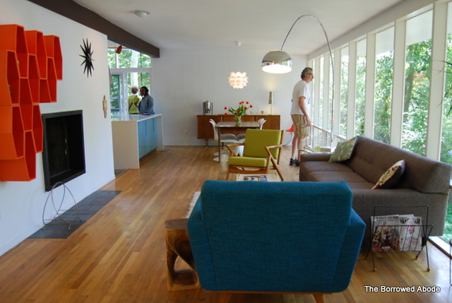
We headed upstairs to the living room/dining area, which also ran the length of the front of the house. Everyone said “wow” as they emerged in it!
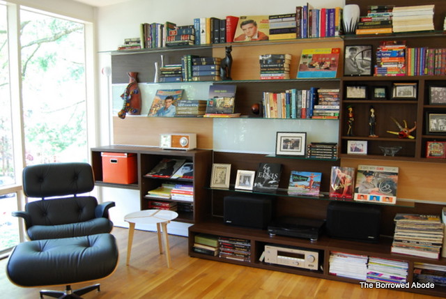
I noticed that the owners used an interesting combination of Ikea Besta cabinetry and shelves in assorted wood tones and sizes to create this interesting storage wall. It’s not quite how I’d do it, but it looks great and fits the house.
The living room and dining area were so beautifully balanced. Decorated but not cluttered. I could feel myself living in it.
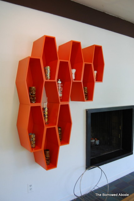
And this hexagonal wall shelf! How I love it. I have a great collection of retro glasses and I must find this shelf. Do you know who makes it?
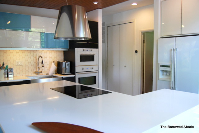
The kitchen was gorgeous, I think with Ikea cabinets, but I didn’t photograph it well.
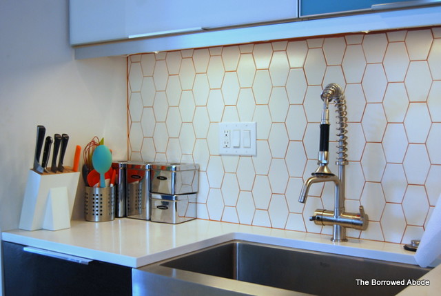
We appreciated how the owners carried the hexagonal theme from the living room around the corner and into the tile back splash.
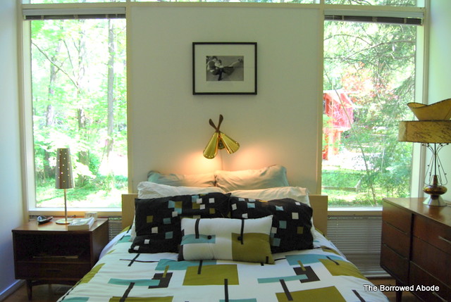
The bedrooms are small but really, Ryan and I agreed that smaller bedrooms are worth it for the awesomeness of mid-century. Plus, it’s all you need.
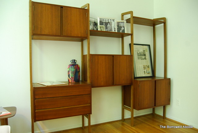
Love this modular shelf unit. We’re debating building one.
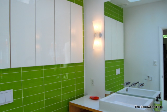
The bathrooms in these mid-century homes are tiny, so photography is a challenge. This one was gorgeous and quirky, with a huge skylight and some special diamond inlay on the lower cabinets (not shown). I personally loved the bright green glass tile as well as the long wall of shallow white cabinets.
One thing this house taught me – or rather, reinforced for me – is the belief that Ikea furniture can be used to create a beautiful space. The key is to use it in moderation, and balance it with a mix of other furnishings.
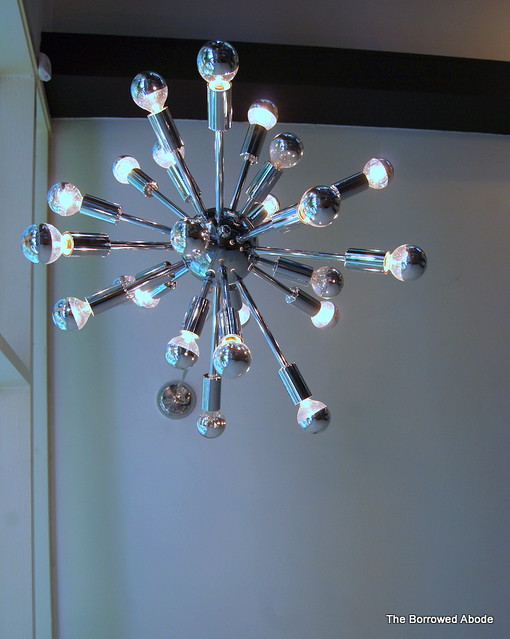
As we left, I snagged a quick shot of the fantastic mod light fixture hanging over the open stairway.
I hope you enjoyed this virtual tour! Tomorrow we’ll look at some of the more quirky and not-my-style spaces.
In case you missed it:



No Comments