

What was supposed to be a quick weekend painting project to kick off the new year has become the Great Gray Paint Debacle of 2016.
First, an update on the living room. After some debate, we decided to stick with the first dark gray that we chose. It’s looking good.

I thought that choosing the right dark gray for the living room was hard, but it turns out that choosing the right pale gray for the rest of the living space was the real challenge.
On Monday I tackled painting the kitchen, dining room, and hall with the light gray we’d chosen. As I began to cut it in against the trim in the kitchen, I had a sinking feeling that we’d chosen the wrong color yet again. But I had a gallon of the paint, and I know the color can look different after it covers a wall and dries, so I continued painting.

By the time I had the kitchen done, I knew the color was all wrong. It was too light; it almost blended in with the white trim, and its blue undertones looked sickly purple against the kitchen.
And that’s when I realized how mismatched* our cabinets and backsplash were. The cabinets have an reddish orange undertone, while the tiles are a yellow brown. Now that I’ve seen the mismatched undertones, I can’t stop seeing them!

Ryan and I have spent hours talking about this and sorting through paint samples. On Monday night I sat in the kitchen for hours, trying to figure out where I went wrong and how to fix it.
At one point Ryan teased me about hiding behind my high chair command station 🙂
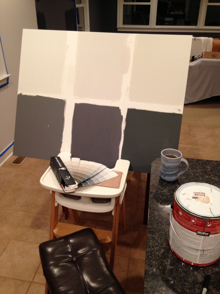
I tried continuing our dark gray into the kitchen, thinking that maybe that would be dramatic enough to distract from the kitchen undertones. Nope. It looked pretty awful, and not just because it was one thin coat.

Then we discussed reverting to the original wall color – a yellowish white that didn’t excite us, but never bugged us in the kitchen. But now, with the dark gray blue living room, the yellowish white looked pretty bad.
Last night I picked up 4 more paint samples to try. On a whim I grabbed a sample of Perfect Greige, just to see if that worked better than the grays. The Greige appeared to work well, but it was so brown. Not what either of us wanted.

Sherwin Williams colors, from top to bottom: Perfect Greige, Morning Fog, Lazy Gray, Gray Screen
This made it clear that we should have used grays with brown undertones.
The house has been in disarray for over a week, and frankly we’re just over this whole thing. Late last night we decided to go with our favorite, Lazy Gray, and accept the imperfect match with the kitchen for now. After all, as renters we can only control so many aspects of the house. If it drives us nuts, we’ll repaint again in the summer or fall.
If we do repaint again, I will first purchase a color consultation from Maria Killiam, the designer who specializes in color. It would be money well spent, considering that we’ve now spent over $200 on this and still don’t have the perfect match. A $50 consult is barely more than one gallon of SW paint . . . so I would have saved money in the long run.
I’m annoyed by how much money I wasted. I feel like I could have prevented this by thinking more before we started, but frankly I was out of practice. It’s been a while since I tackled a real decorating project. So I’m just trying to learn from this experience and cut myself some slack.
At least our living room looks awesome, even though it’s not re-decorated yet! We decided to stick with the original dark gray that we chose. I don’t know the name of it, because I lost the paint chip.

*While the kitchen colors feel like a disaster, I assure you I’m keeping it in perspective. There are far bigger problems to have. And our kitchen is functionally great, especially for a rental. It’s rare that an rental home has such a nice, new kitchen.

5 Comments
I LOVE the color of your living room – it really makes your furniture stand out and look amazing.
Light grey is one of the hardest colors to choose, IMO. I think the tones near the paint make a much bigger impact than they would on dark paint. You would not believe how many sample pots of light grey we have in the house 🙂
Thanks Jenn! We’re happy with the dark color. I ABSOLUTELY believe how many sample pots of light grey you have 🙂
I am so glad you shared the color helping resource! I am so hiring her to tell us what color our backsplash should be.
Oh my gosh, I basically did the same thing in our front hall the first time I painted it. I was so out of practice that I picked the most obnoxious coral and knew it was wrong within minutes, but kept moving along. It was so hideous, but I eventually go it right. 🙂
I remember you blogging about that a bit! It’s hard to know because sometimes pushing through to the end will give you a totally different look than what you see when you start out. I guess design muscles are like any other muscles – they need to stay in shape! 🙂