Help! Just when I thought I had planned my office/studio/dressing room color palette perfectly, a fabulous piece of furniture came along and spoiled it all. That wouldn’t be a big deal, except I’ve already set aside the week after Christmas, when I’m off work, to completely transform my studio into a fabulous space, from paint to curtains, to shelves to chair upholstery. So I need to make a decision quickly!
But first, the backstory:
Inspired by the shimmering painted trellis wall done by Kate at Centsational Girl, I wanted to paint my office walls a solid shimmering silver, to give it a bit of an old Hollywood glam feeling. I’d then flank the closet with curtains made from the Joel Dewberry Ginseng geometric print shown above, and create a slipcover for my desk chair out of the two fabrics shown. A custom painted and fabric-covered cork board and some other wall accessories would round out room. Finally, I’d hunt down an old Louis XIV chair and recover it in a fun fuschia and gray fabric. There’s more to the plan than that, but since it’s been scrapped I’ll leave it at that.
This plan encountered a small snag when I went to the Benjamin Moore store and discovered the metallic paint in the “Modern Masters” was not only $120 a gallon, but it required a special roller, special paint fixative, and other items. There’s no way I was going to spend about $200 just painting my walls. Even if it is “good” paint. I thought of doing a stencil like Kate did, but with all the storage I need to put on the walls, a stencil would be too busy. So I’d settled for just plain silvery gray paint.
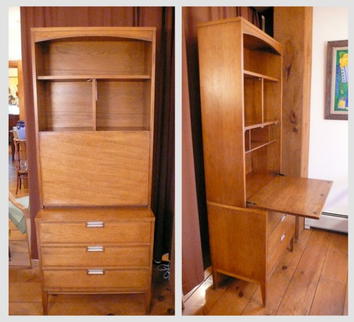
But then the plan changed. While perusing the items for sale at Just L, the fun mid-century modern furniture store in New Hampshire, I found this 1960’s walnut secretary:
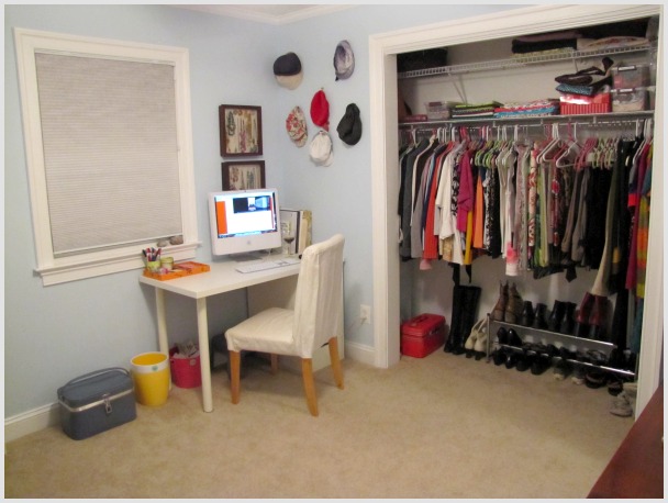
I’ve always loved secretary desks, because they offer such tall functional storage and work space, while allowing you to close up the desk at the end of the work day and hide your computer. I measured the space where my current boring white Ikea desk sits,
and get this – that secretary would fit perfectly in the space between the window and the wall. I’m usually a fan of working with what you have, except in the case of a piece of furniture or art that you love, and know you will cherish for decades down the road. A piece like this would totally work in so many situations – a future guest room, or kids room, for example. When I have kids, I may not have the luxury of having a home office – and this piece could sit in a living room or really any part of a house.
Once Ryan agreed that it was a great piece, a new plan began to form. Instead of a pink and silver glam room (with tacky white laminate desks and storage pieces) why not create a fun and funky mid-century modern space?
So now I need your help. I’m in a hurry to choose a new color palette, so that I can order the fabric ASAP and be painting by 12/28. The only problem? I’m not really feeling many fabrics that I see, and I have a serious fear of decor commitment.
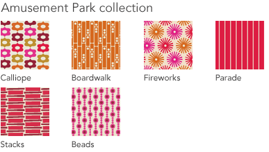
I’ve always liked the Jessica Jones collections, like this one, but I think there’s too much red and pink and orange in it. I’d really like a fabric pattern with a ton of colors, so that I can choose a good neutral or pale tone for the walls and then play up the different colors with funky accents. I don’t want to be as tied to a single color scheme.
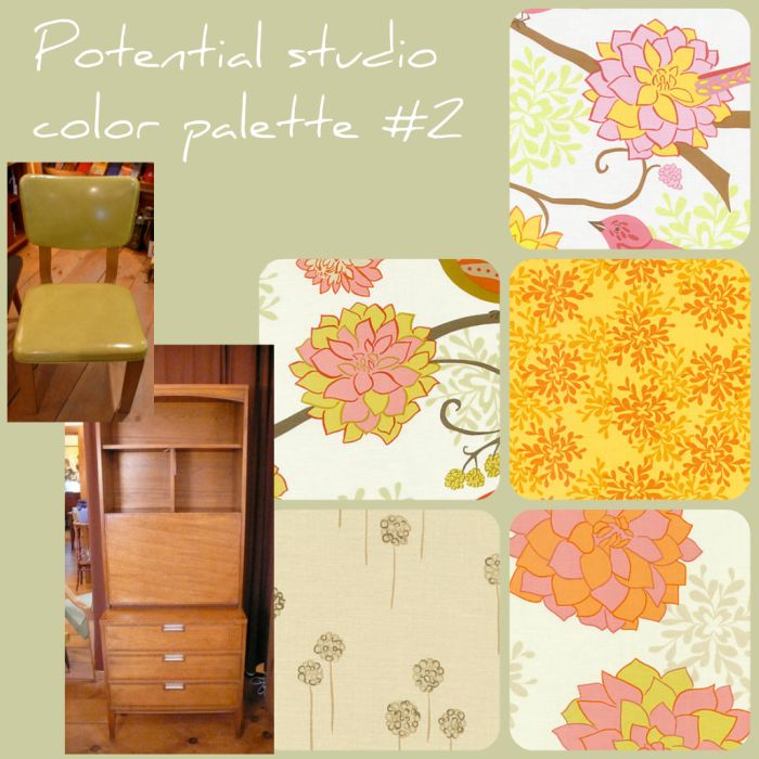
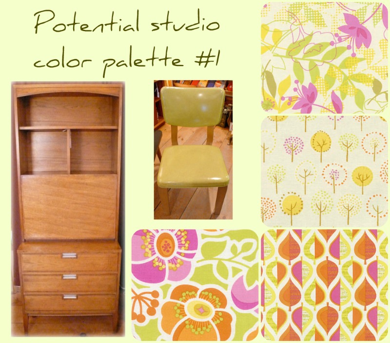
With that in mind, I searched a ton of fabric sites and came up with two palettes:
First, that chair is also another piece from Just L that I have my eye on. I love the vintage lines, as well as the seemingly indestructible lime green vinyl upholstery. The fabrics are from the Wildwood collection by Erin McMorris, and I like that the walls could be painted a variety of pale tones, from a greenish taupe to a stronger lime color – and then there’s pinks and oranges and yellows to play around with as well. The curtains could be made from the chunky floral print, and the accents and fabric storage bins could be made from the tree print, and the cork board could be the leaf print.
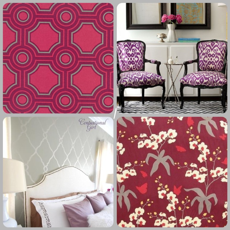
Actually, now that I write this out – I’m really feeling it. But here’s the second fabric palette just in case:
 This fabric set is the Nest collection by Valori Wells. It’s pretty, but not as funky. Yeah, now that I see the two different mood boards compared side by side, I’m definitely digging the first. But I’m curious – what do you think? Are there any other fabrics you can think of that evoke mid-century modern, while still using bright random colors? I’d love to hear your thoughts!



12 Comments
Love that green chair! I’m actually digging the second one for some reason, but go with what makes you happy!
I was completely hooked on the first one before I even finished reading.
Oh gosh, I really love both! I think I love the first one a little more though. I especially like the fabric swatch in the bottom right corner.
I really adore the floral pattern in number 2 but the first one totally had me at hello.
Can’t wait to see it all together!!
xoxo,
Jen
I am loving the first collection, especially with the middle fabric! With your walls being such a vibrant color, I love the calmer design in that fabric! I could totally see some fuschia (sp?) ribbon lining the sides of that fabric, or you could even bring it in with your bulletin board!
Oh I love that secretary! It’s totally worth rethinking the room to make something like that work. Um, I think I like the first one too, but I really like that floral in the second option too.
Jane-
I love them both! I just finally picked a fabric for my office and it’s lime green pattern too, but my accents are brown and green paisley to go with the big brown leather sofa in the room. I love the first choice, it has a bit more “pep” 🙂
Both are awesome! But I’m leaning towards number 2. I think I like fabric picks better.
oh. my. gosh!
take the top right fabric swatch from #1. add it to #2 and you have fabulousness forever! <3 im in love!
xoXOxo
I like #2 something about the wall color plus that fabric makes me swoon.
[…] currently in the midst of tearing my office apart and prepping to implement the big makeover plan. I had a heck of a time finding just the right shade of paint – but that’s a story […]
[…] first thing on that list? Painting my office to match my new fabric. A few weeks ago I shared the color palettes I was considering – and here’s what I […]