

I feel like I spent the last week up to my ears in fabric for the bedroom makeover. My fabric samples arrived from fabric.com, and most of them were a disappointment. That’s when I realized that it’s tough to select fabric over the internet if you’re not used to working with home decor fabrics.
The only sample I really loved was the one that Ryan absolutely hated, the Taupe/Robin print. We try to come to mutual agreement on any decisions that affect the look of our home, so I headed over to JoAnn Fabrics to find more fabric options.
While I’m all about decorating rooms on the cheap, I’ve decided that it will be worth it to spend a bit more on the fabrics for the window treatments and throw pillows. Thank goodness, because I discovered that I have expensive taste. Story of my life! My eyes were drawn to both Robert Allen and Annie Selke fabric lines. Fortunately the 50% off sale going on now at JoAnn’s gives me more options, price-wise.
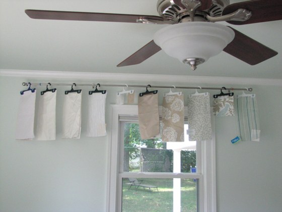
I checked out the 8 fabric samples I was most interested in, and hung them in the bedroom to compare:
 I really liked how the sandy tones of fabrics 6, 7, and 8 looked against the walls. I liked the colors and pattern of 9. Samples 10 and 11 were vetoed by Ryan. We also decided that the white fabrics, 1-5, were out. They just didn’t contrast enough against the pale seafoam walls.

So which fabric do you think we chose for the window treatments? The blue and white pattern, or the sandy botanical print one?
 Or maybe the brown and white striped fabric?

You’ll have to wait and see, because I’m not sharing the answer with you until I’ve sewed and hung the curtains. But in the mean time, feel free to take a stab at reading our minds. . . or let me know what samples you love or hate!
And if you’re new to this bedroom makeover, you can read about the paint dilemma (solved!), the choice of budget bed linens here, and the budget drapes that did NOT work out.
Immediately I realized that the white fabrics, 1-5, were out. They just didn’t contrast enough against the pale seafoam walls.

12 Comments
I am loving the sandy botanical with the color of your walls! The pattern is subtle, but interesting. The sandy color balances the more feminine botanical pattern. I like the blue pattern, but I’m feeling like it’s a little too busy, and doesn’t provide enough contrast with the walls…a little too matchy matchy perhaps? Both are lovely though, it’ll be at tough choice! Best of Luck! 🙂
Even if you’re not going to do the drapes in the Taupe/Robin pattern, you MUST have a pillow or two with it. I’m excited to see what you do with the room, Taupe/Robin pattern or not. 🙂
Oh and out of the two you narrowed it down to, I like the sandy botanical. But I think the blue stripes (# 11) might keep better with the beachy feel. And it looks like it’s sheer, which I love even more. Although, I really do like the white curtains you had up, from IKEA. Maybe you can layer the two?
I really love 8, 9, and 10 Jane. They are all beautiful, but those three collaborate the best in my mind.
And Ryan was right about the white. It is a bit washed out with the sea foam. Way to go with your sewing skills!
I just read your post and I saw this neat little idea over on Mandi’s blog about making her own curtains (http://candimandi.typepad.com/heres_lookin_at_me_kid/2010/07/diy-curtains-from-thrift-store-finds.html). You two make me think I shouldn’t have a bare window anymore! 🙂
I’m digging the sandy botanical, and ditto on making at least a pillow out of the robin fabric. That space is turning out just lovely!
Oh, and you should totally use the samples as a background for art or part of a gallery wall. They’re very pretty!
I like the sandy botanical print myself. Although I think you should have vetoed Ryan’s veto of #10. I love it! Can’t wait to see how it turns out.
I would use 6, 8, 10, & 11. Be sure to alternate the fabrics on the pillows so that just by flipping it you can alter the look/feel. Make a patchwork pillow from the sample swatches! If the curtains are one fabric you might contrast trim, bow or tiebacks with another, or add a sheer for privacy and allow light…and maybe pick up the robins egg/turquoise color.
So many good options but I really like the sandy brown background with the white Queen Anne’s Lace print. Can’t wait to see the finished product.
I know it has been quite awhile since you posted this BUT, do you know the name of #9? I went to the website and couldn’t find it, I am sure its discontinued with my luck but thought I would ask…Thanks!
Hi Nicole,I know it’s a Waverly print but aside from that I have no idea. I’m guessing it is discontinued because they change things up fairly regularly. Maybe search on Fabric.com for waverly fabrics?